Creating an identity for disruption.
When I started with AECO Innovation Lab, the company was new and had bold ideas about disrupting their industry. As a venture lab, they felt their sector was stuck in the past, and needed to be pulled into the future with cutting-edge tech and innovative ventures. My job was to build and launch the identity and all its assets to get the brand off the ground.
To understand the business goals for the brand and get to know the audience, I met with stakeholders for discussion over hopes, expectations and constraints. We had many working sessions to outline what was needed, what resources I had, and how the design process would work. Because I was in-house for this, I was able to work closely and frequently with the team.
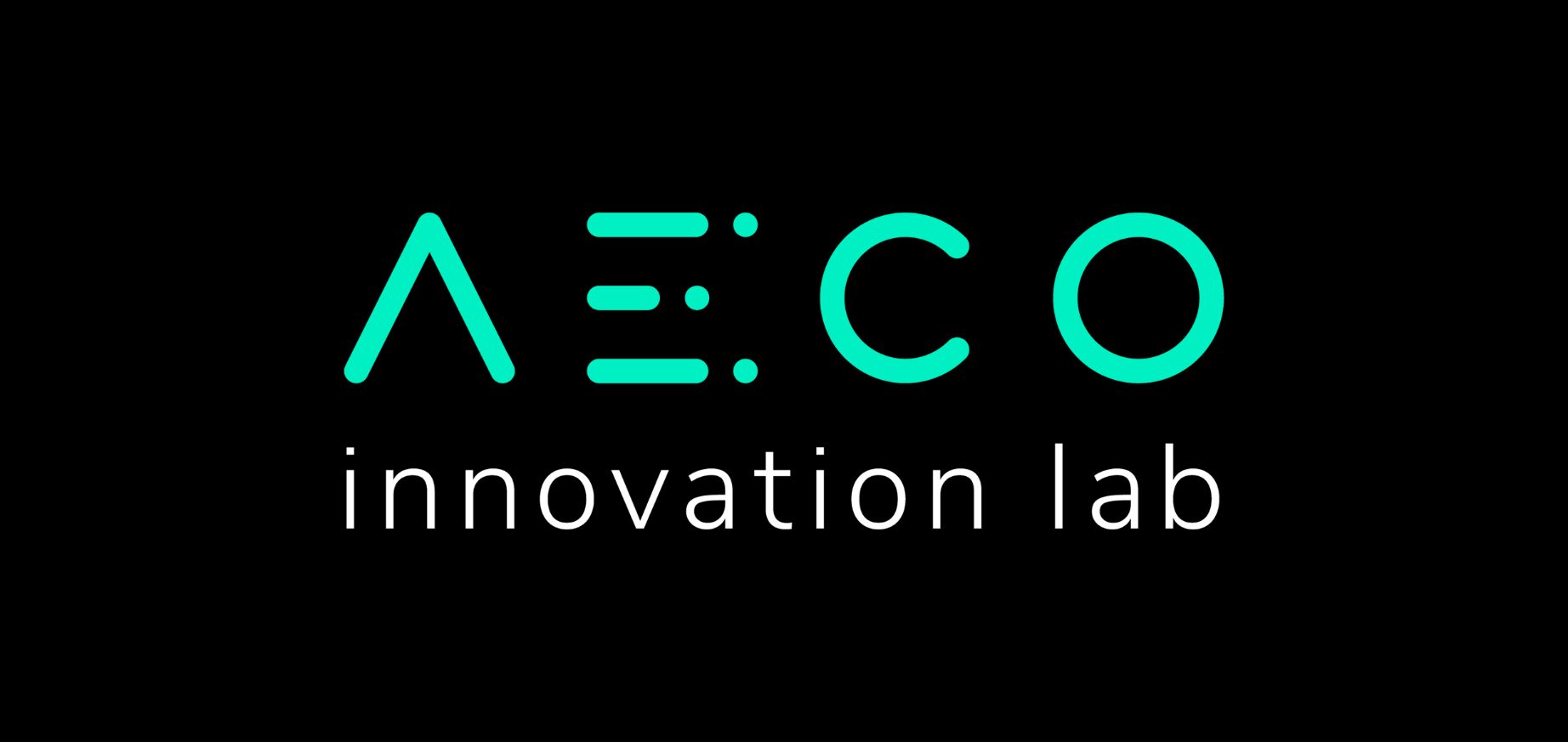
For the logo, we wanted something that felt very tech, very digital and a bit futuristic. I really wanted to emphasize that as a venture lab, this company was made up of groups of individuals all working together, which is why the E subtly became 3 people standing together.
We settled on a blinding neon aqua against a completely black background to achieve the most contrast. The colour almost vibrates off the page. For visuals I used architectural imagery at unique, dramatic angles to emphasize the "disruptive" nature of the brand.
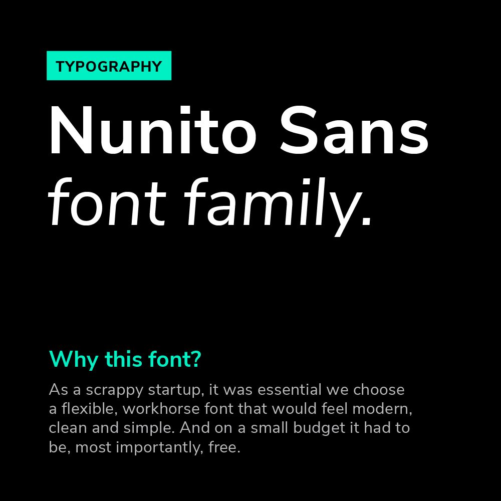
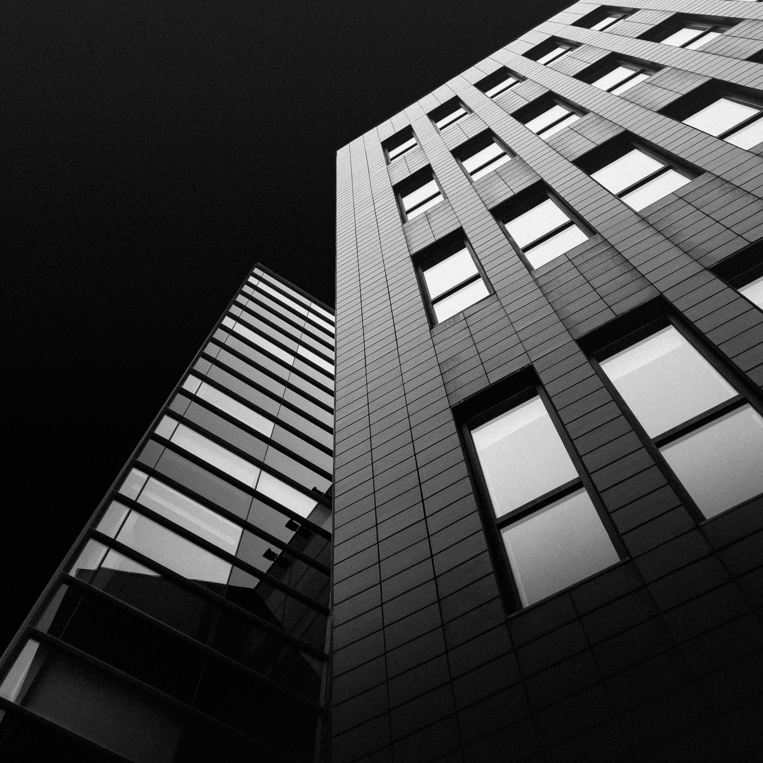
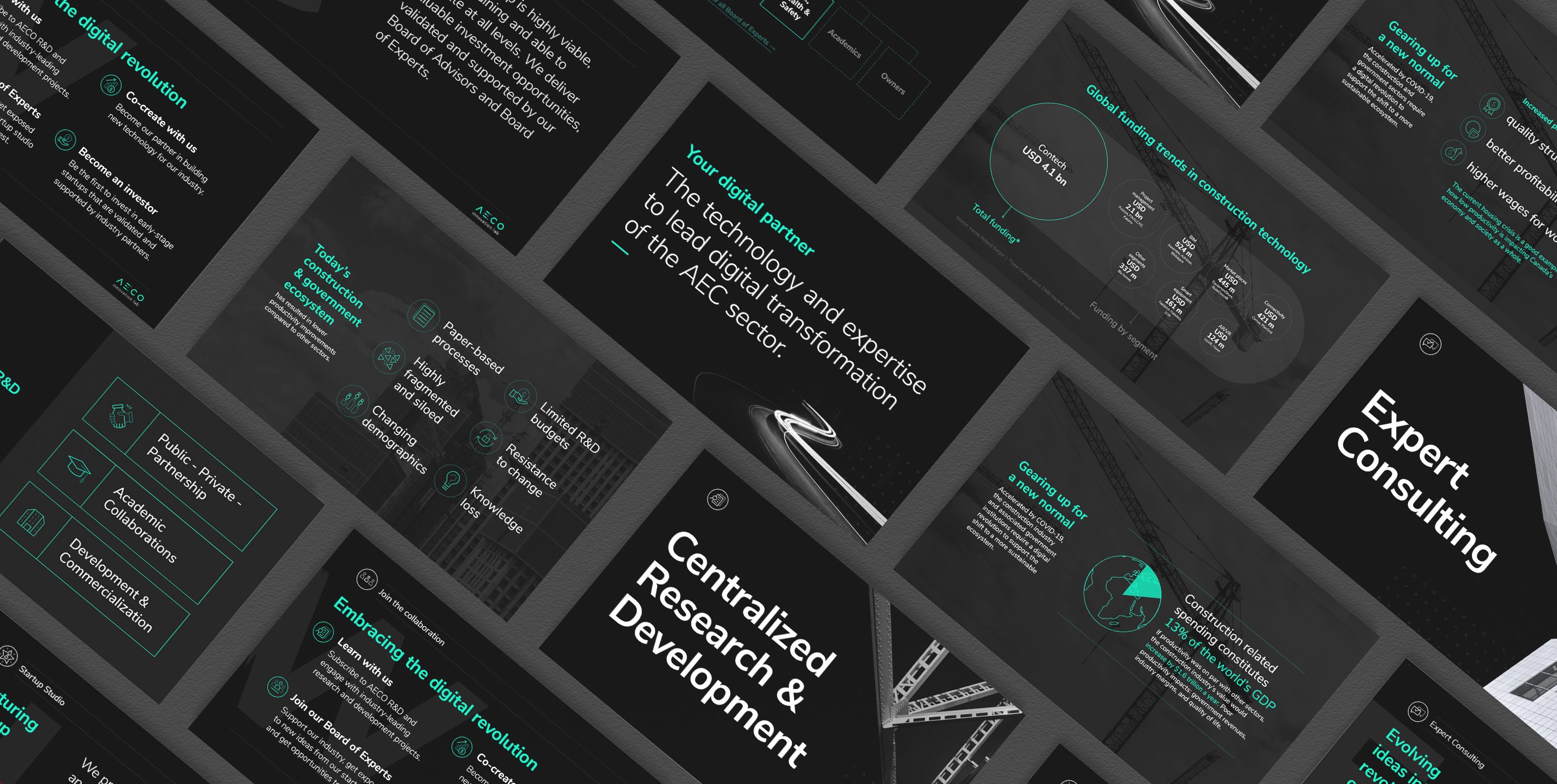
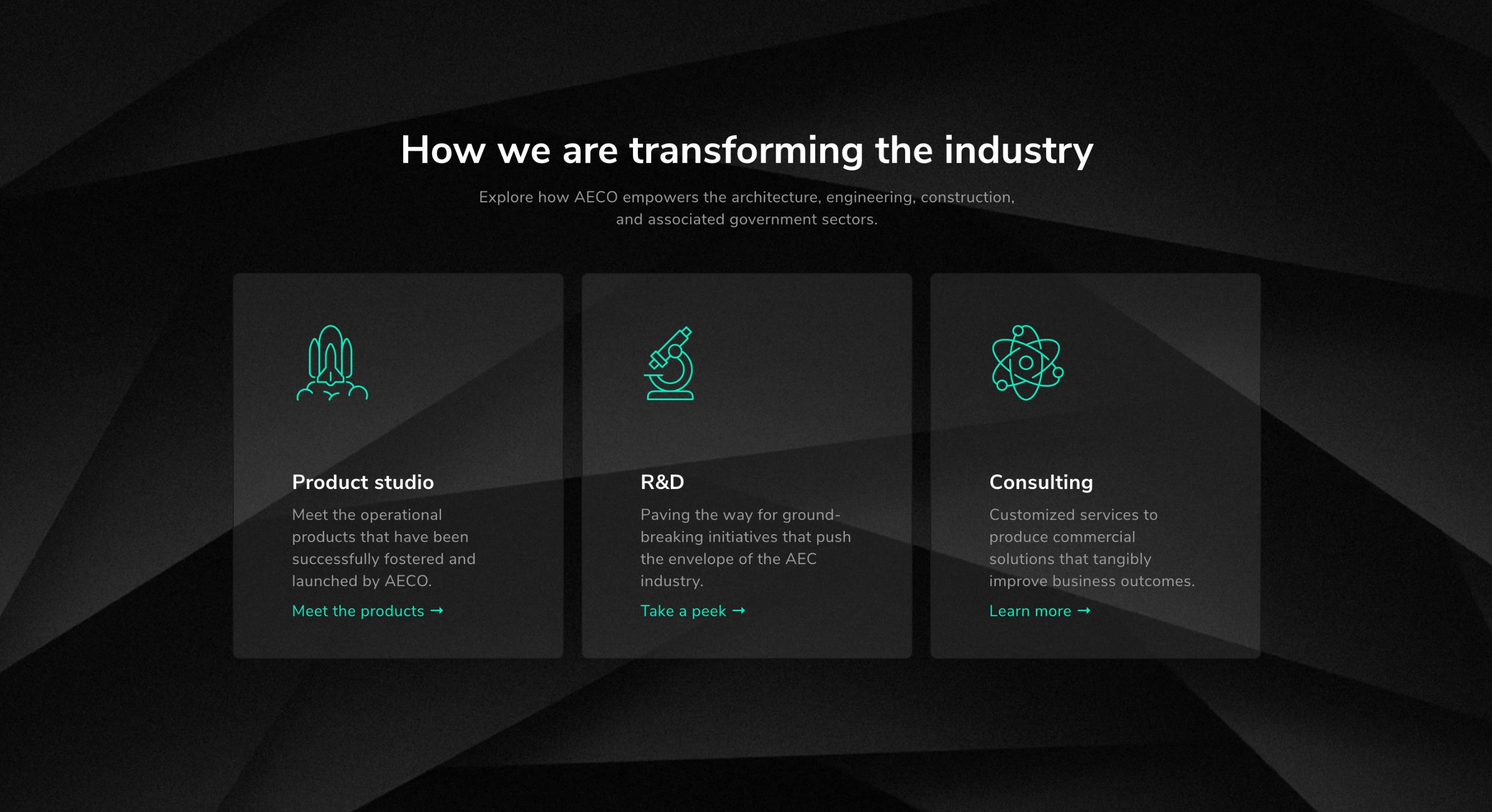
The AECO team was looking to make a dramatic entrance onto the scene. That meant they wanted the marketing and support materials to give their audience a bit of a shock. The industry is very accustomed to conservative, traditional design. So getting strong reactions and feedback on presentations, business cards, website and brochures was a positive indication that we were doing a good job.
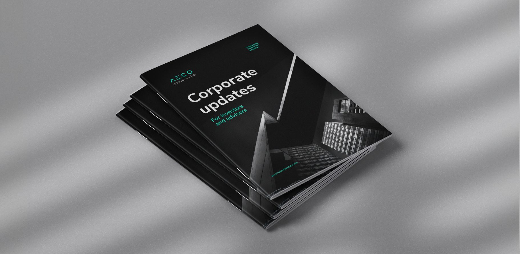
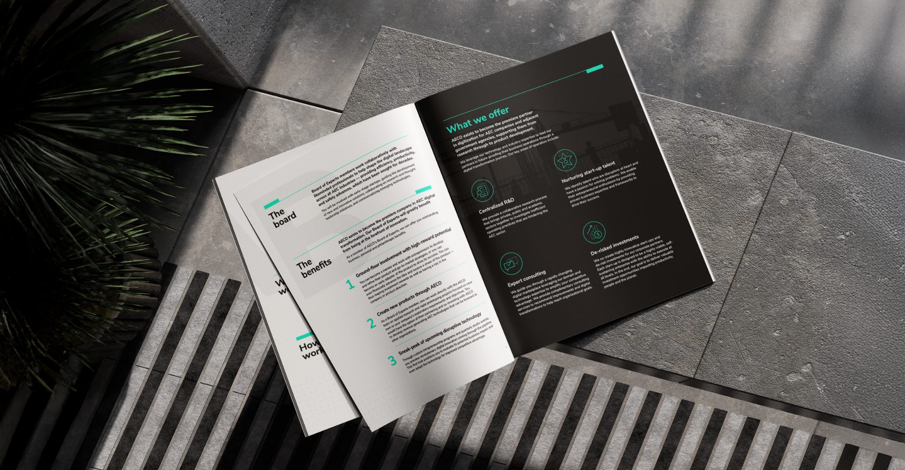
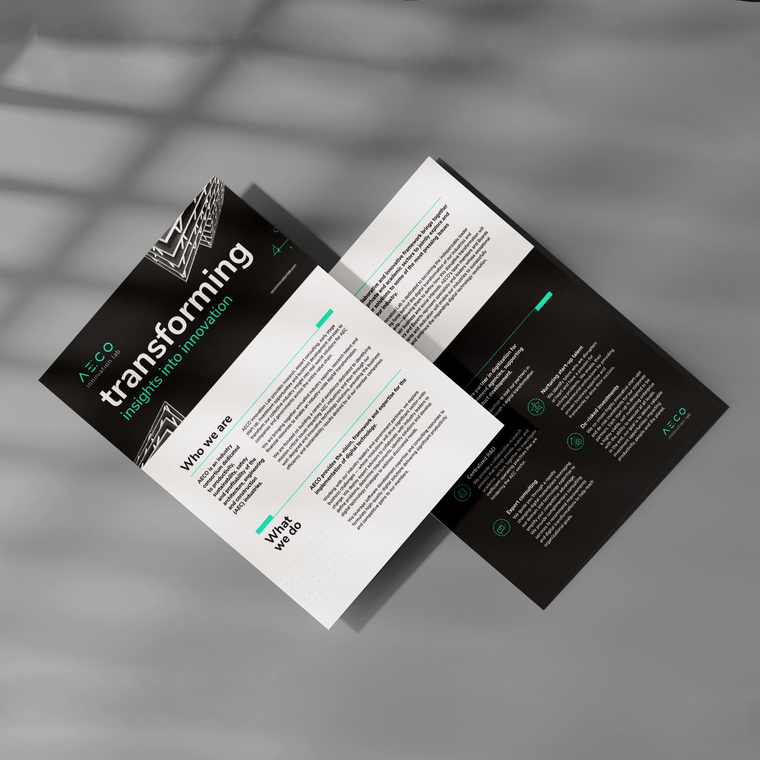
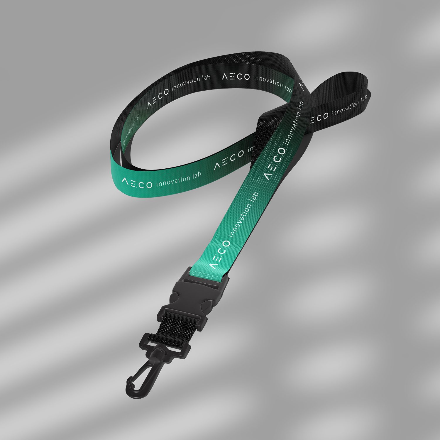
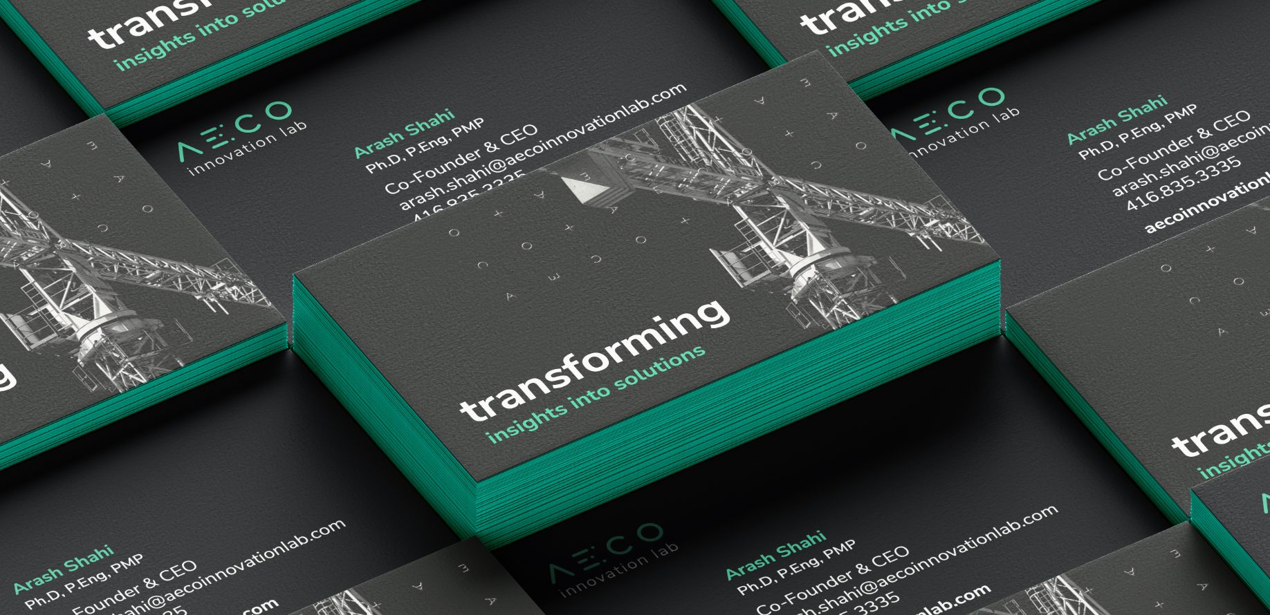
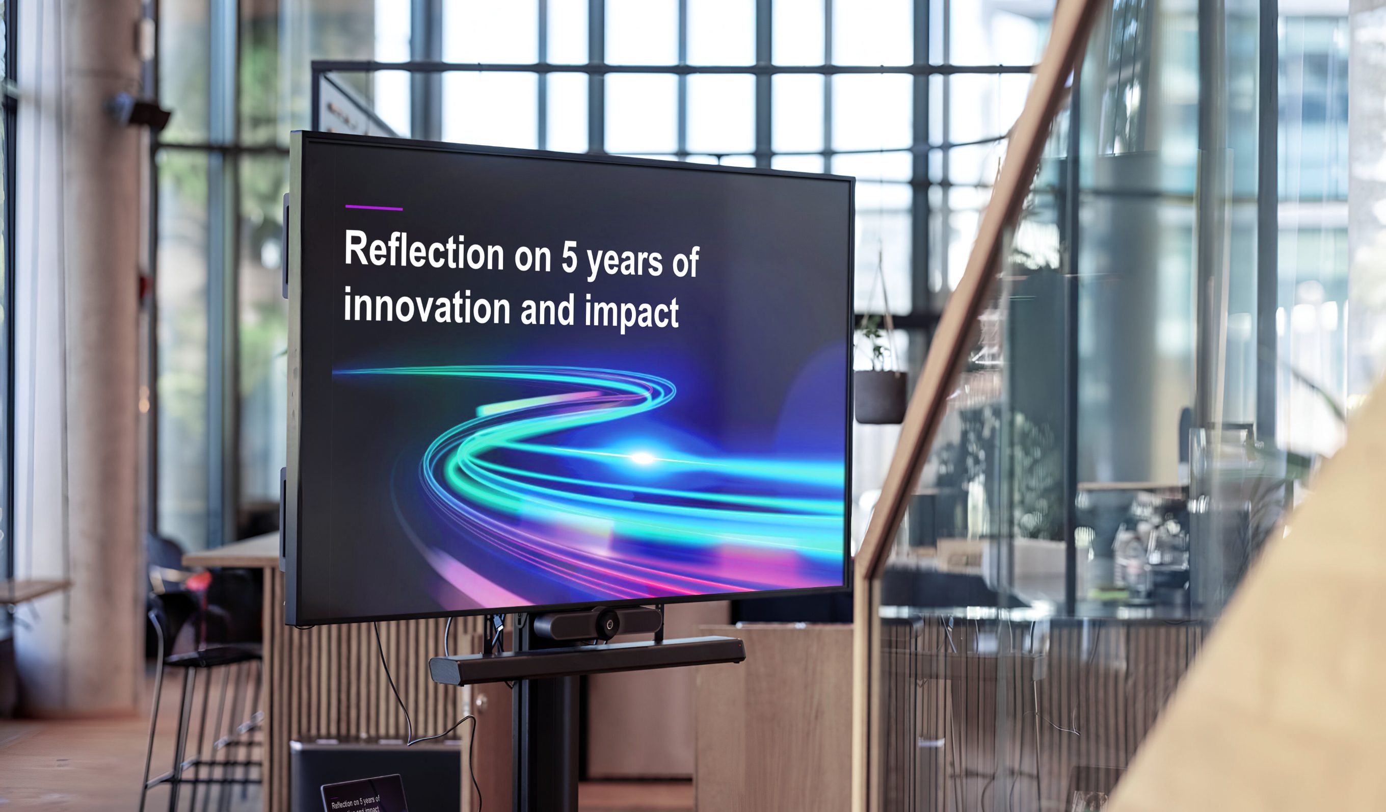
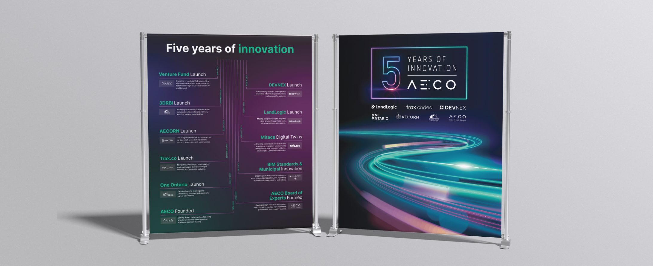
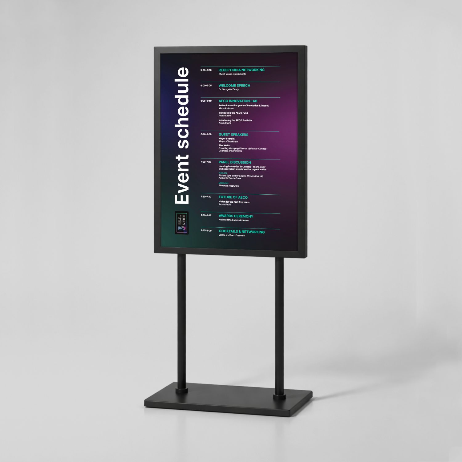
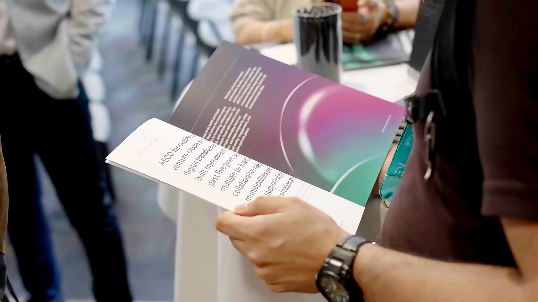
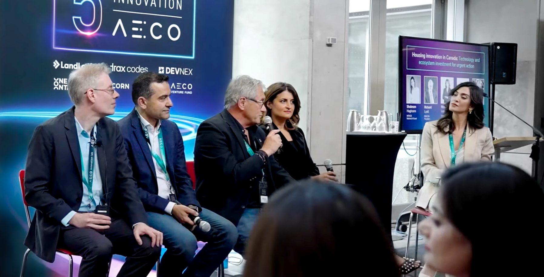
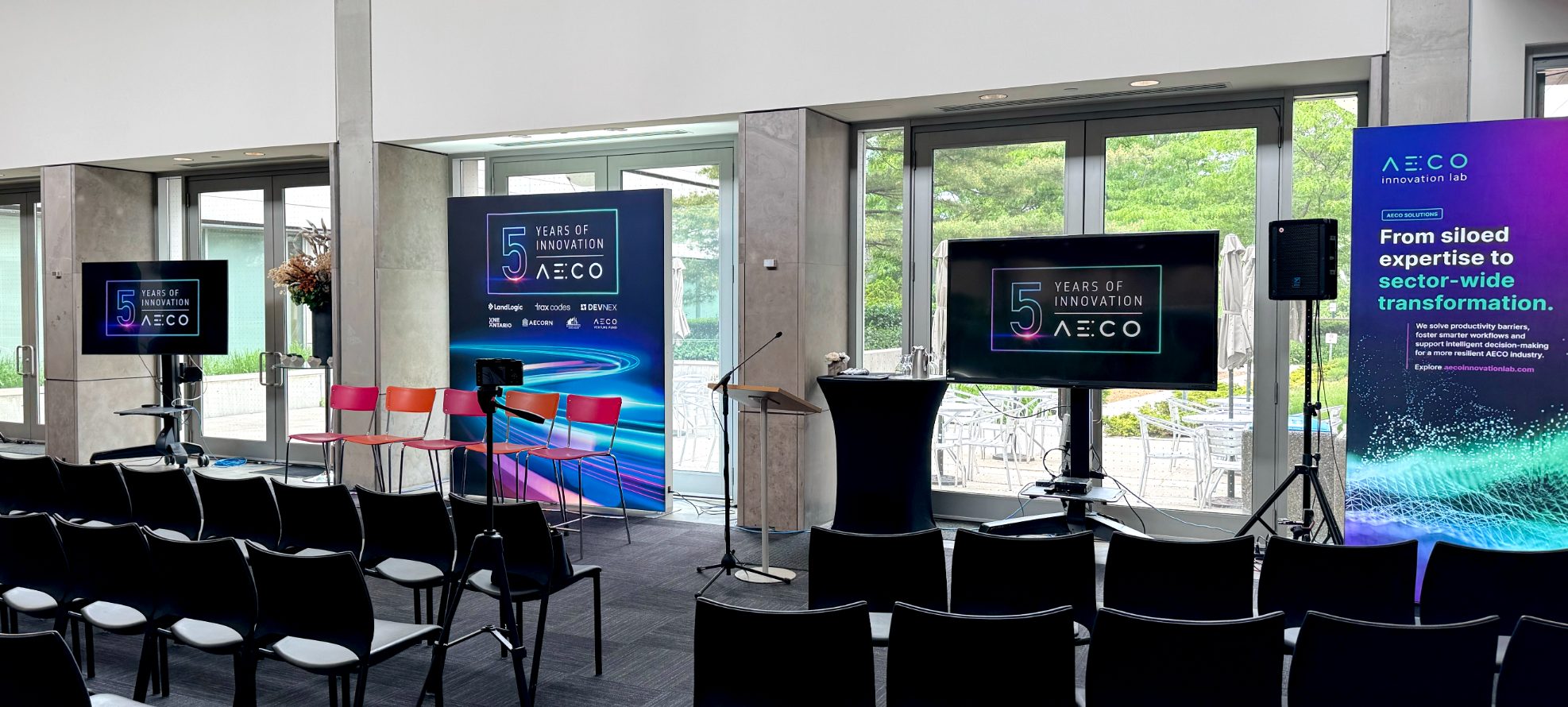
At their 5-year anniversary, AECO wanted to host an event to celebrate the milestone and kick off some new initiatives. After discussing the objectives for the event, I sat with marketing to plan what would be needed. Marketing planned out the operations, and I planned out the assets. One of the main pieces we planned was a booklet that summarized AECO's accomplishments and gave a sneak peek into the future of the company. I printed it with thick paper and a soft-touch cover for a weighty, impactful feel.
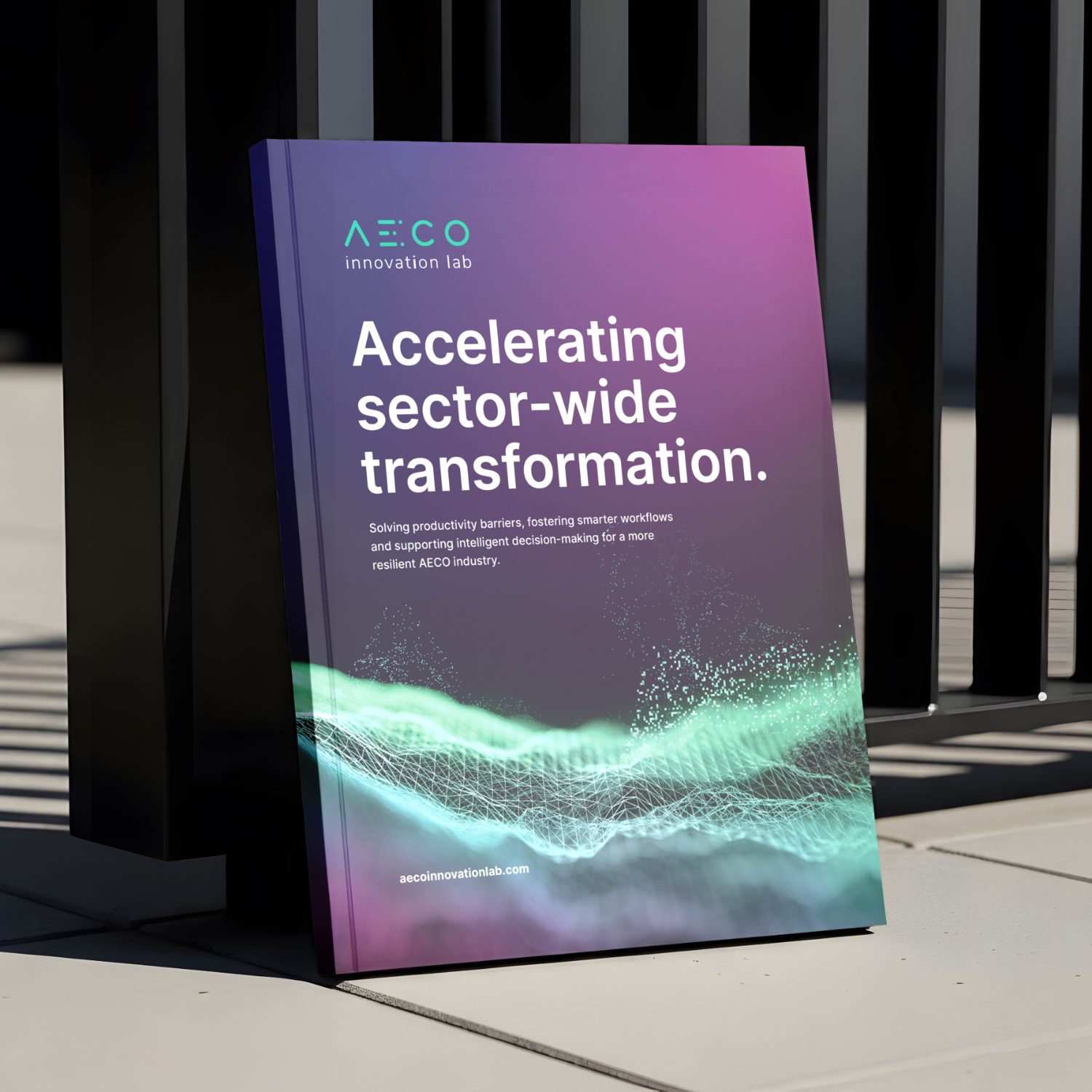
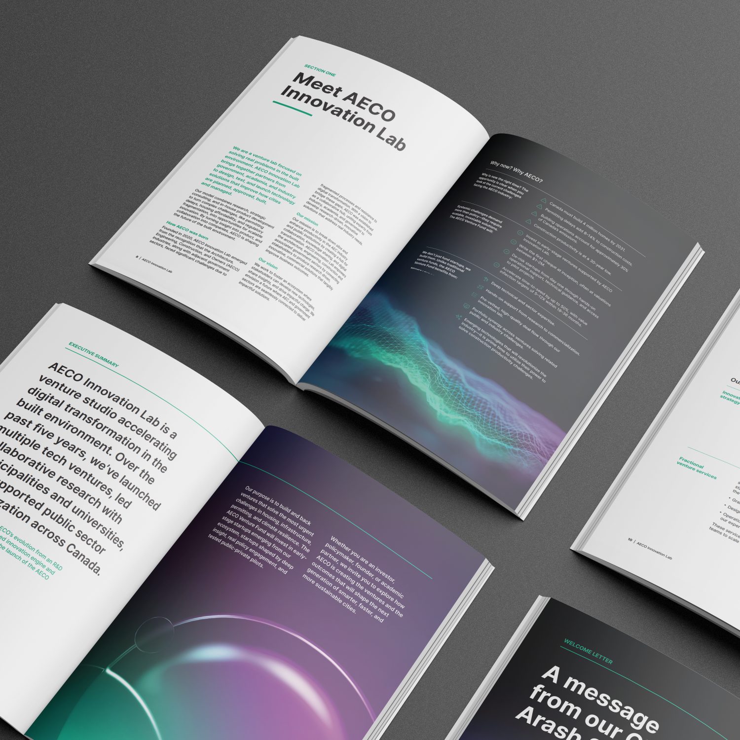
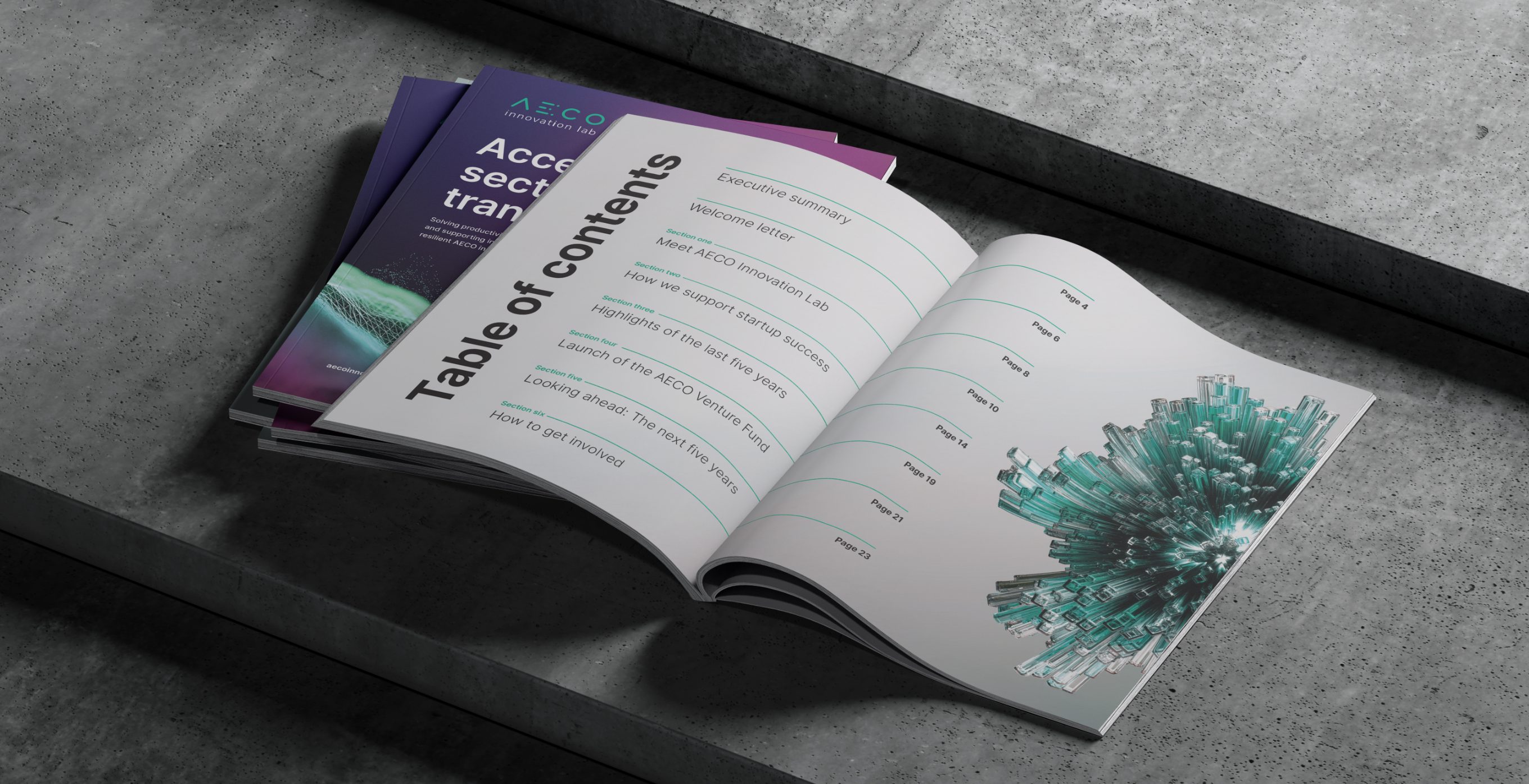
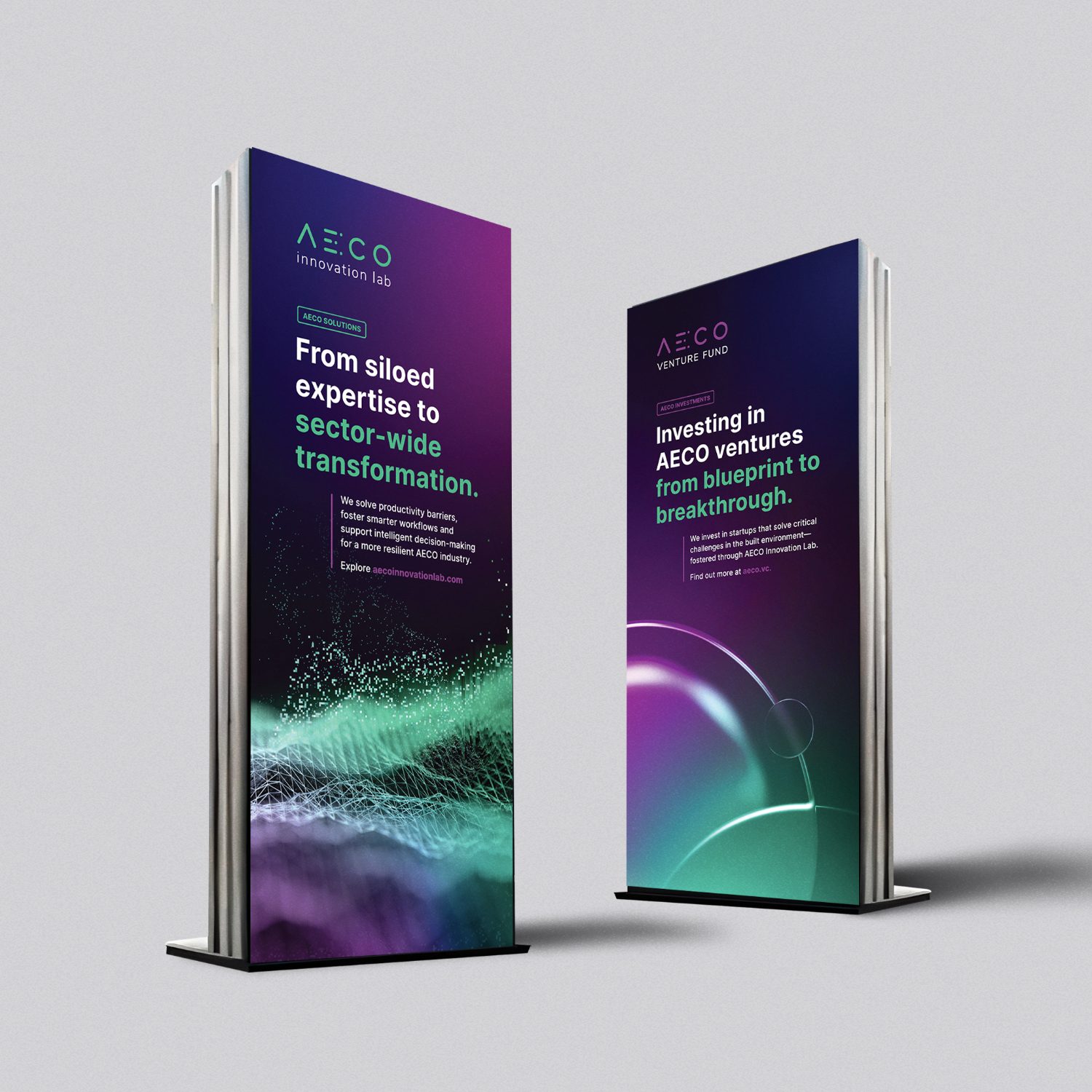
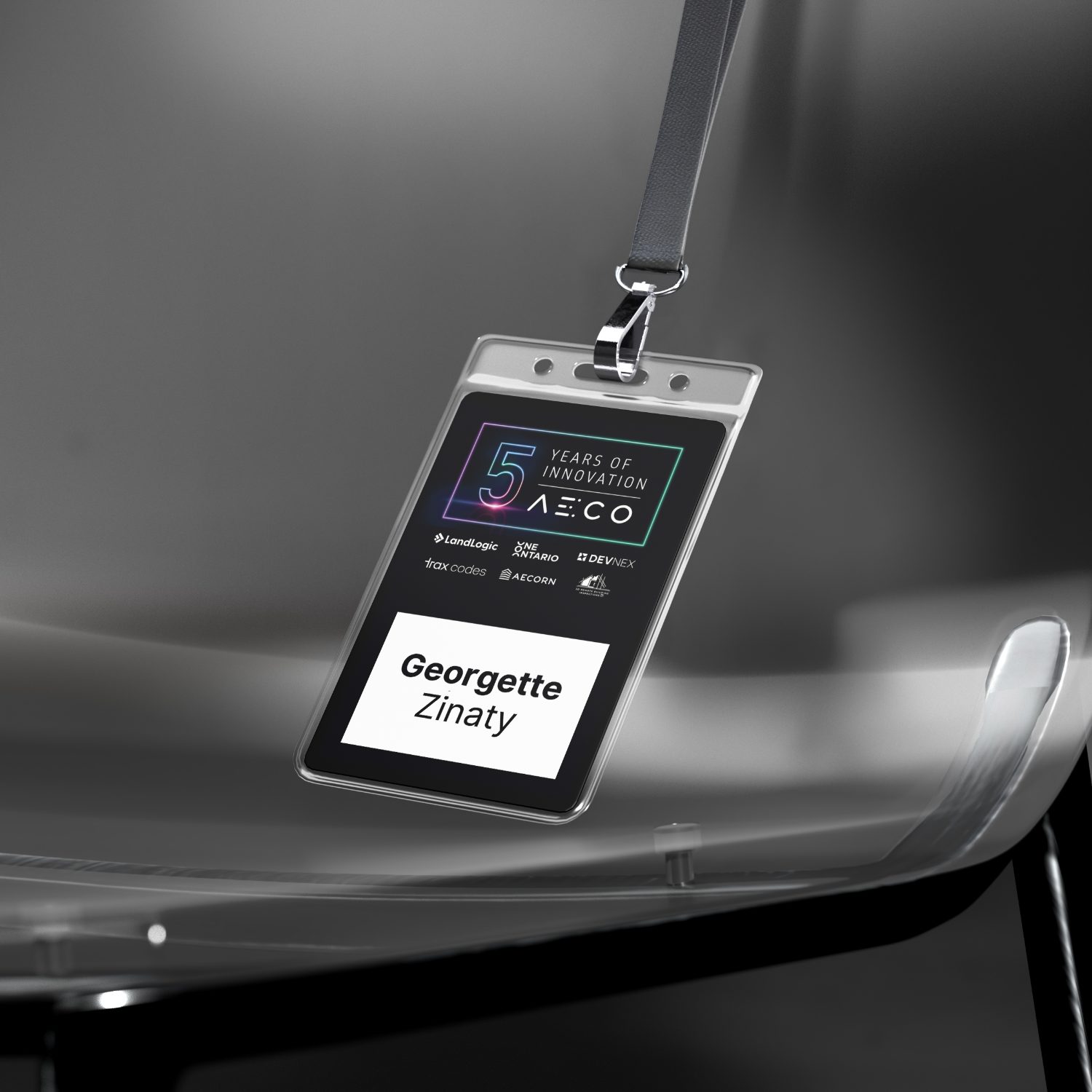
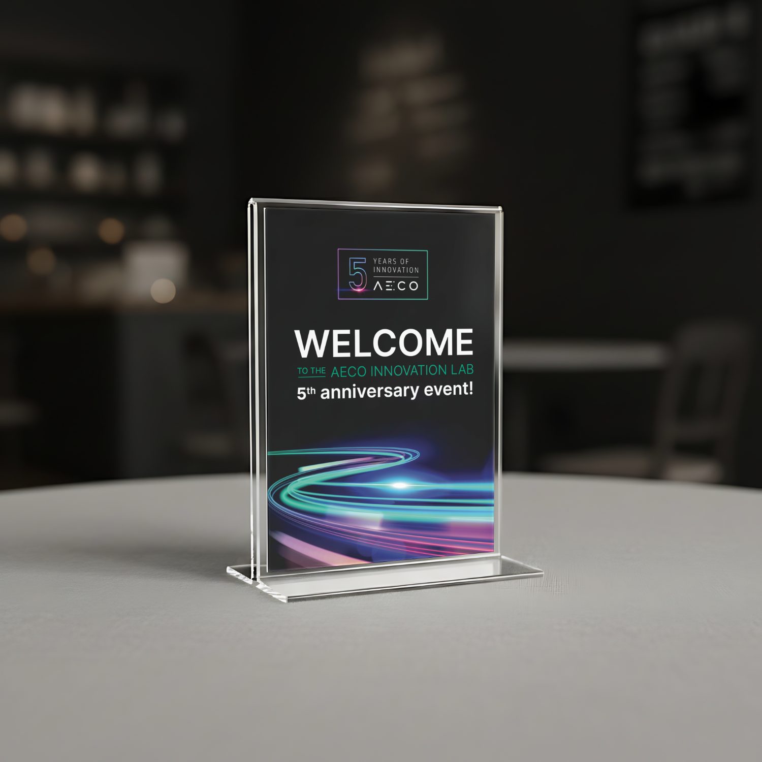
For the event, one of the goals was to make the support materials stand out from the regular brand. So I took the regular AECO style, and added a purple to increase the energy and excitement. I also chose conceptual imagery of morphing, abstract objects to represent transformation, as "transforming insights into solutions" is the company's tagline. I then rolled that out across all the materials.