Building a new proptech brand.
When I started with LandLogic, the company was only a few months old. They were in the midst of creating a property technology platform, and needed to start developing their public presence. My job was to define their positioning and messaging, develop the identity, and create all the necessary assets to get it launched. Following that, I would be the brand owner and continue to develop it as the company evolved.
The LandLogic team was filled with technical professionals who knew their industry well, but didn't know where to start when it came to branding. Being in-house allowed me to lead them through the process. I worked closely with team members to understand their business goals and develop concepts.
We landed on the overall concept that LandLogic is a tech company developing tools that help people better understand how they can use land. So the identity had to support the tech angle as well as the land-use concept. As a new company, it needed to feel fresh, modern and credible.
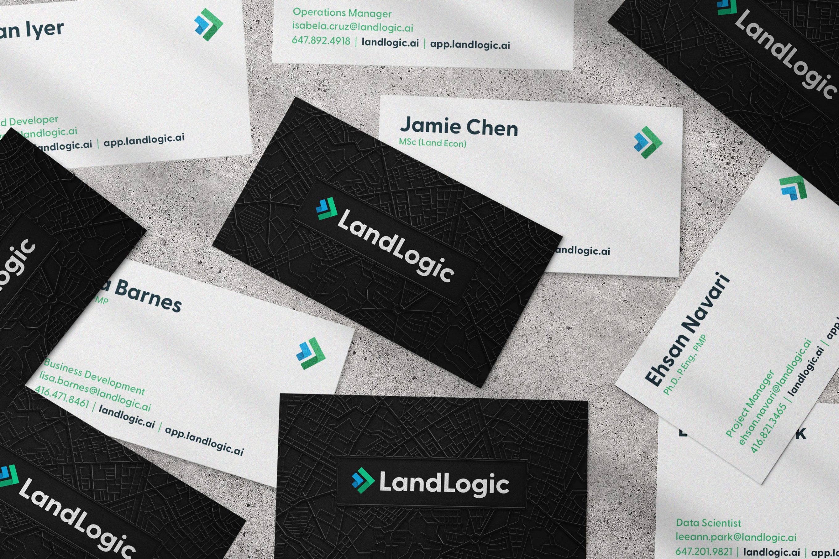
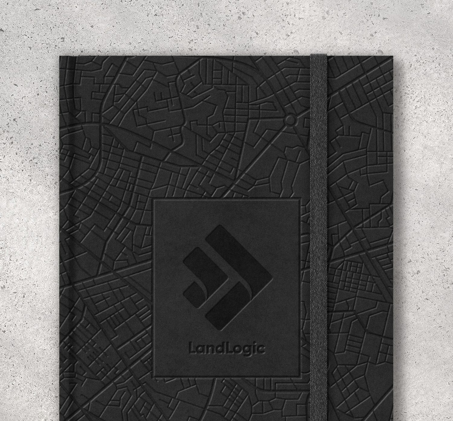
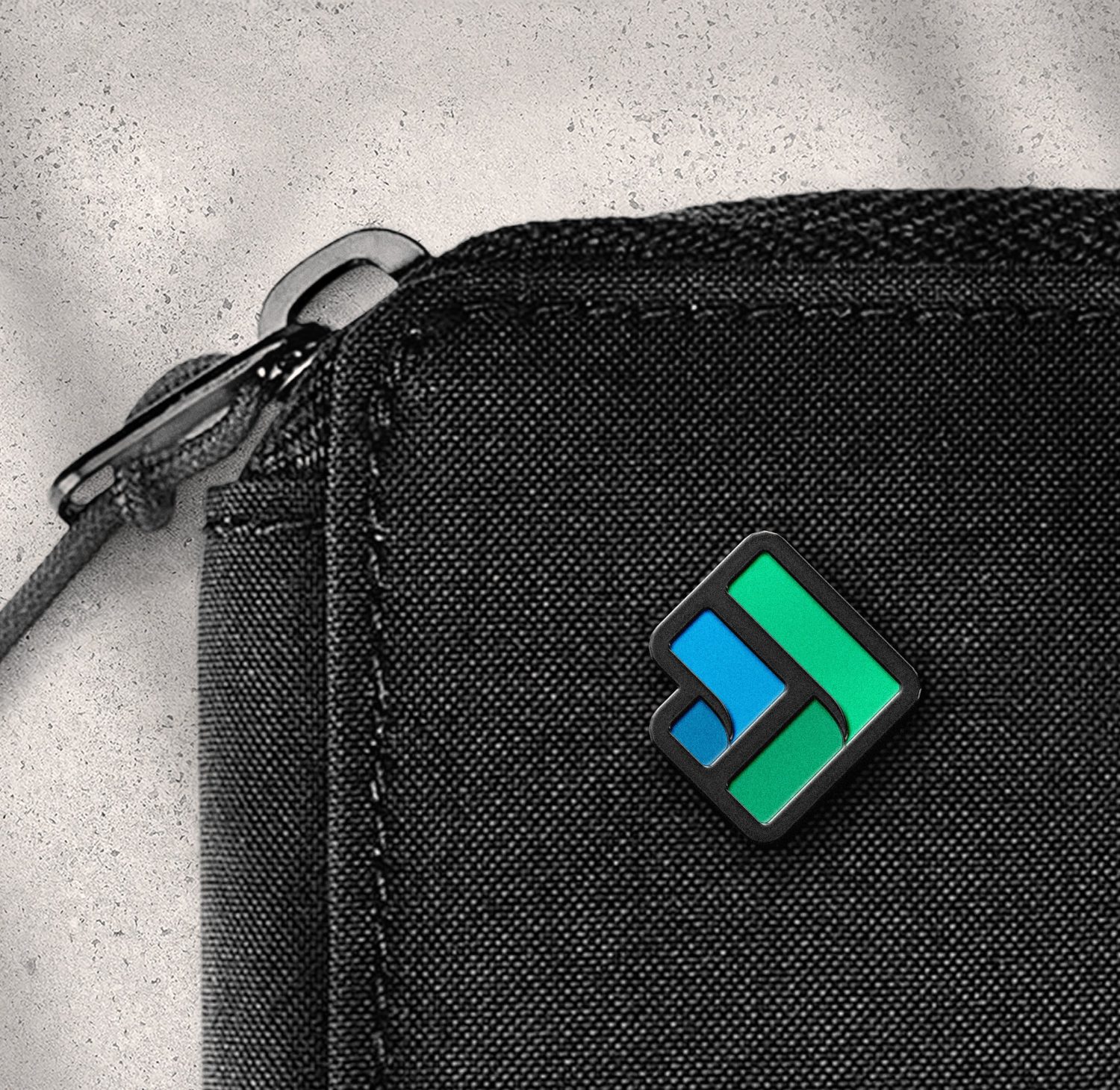
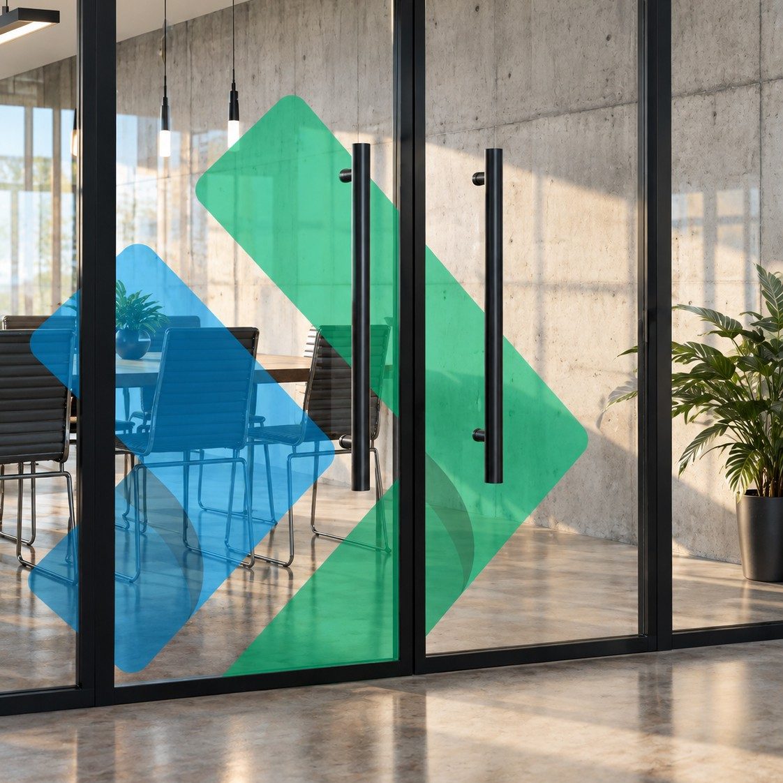
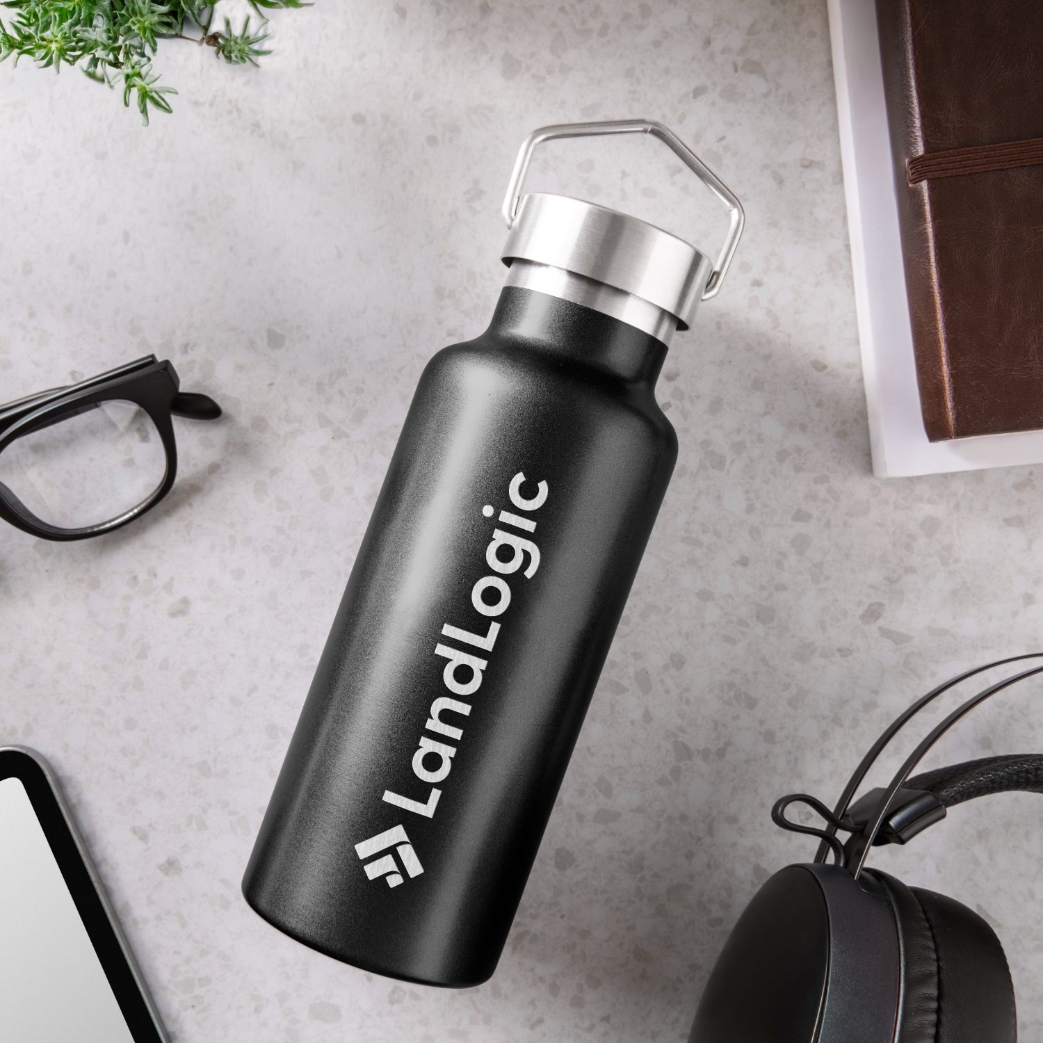
I developed core elements to support this goal. Black represents the tech, and green/blue represent land. The icon itself shows two Ls in forward motion to capture the progressive nature of their methodology.
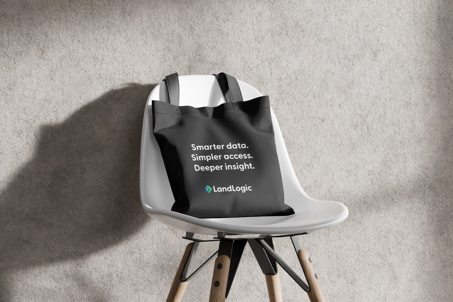
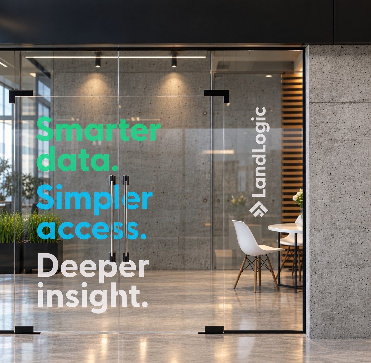
The visual language brings in more elements to tell a story. The platform is map-based, so a minimalist mapping pattern is used on select elements. I also worked with marketing and the C-suite to develop a tagline to help define our positioning: Smarter data. Simpler access. Deeper insight.
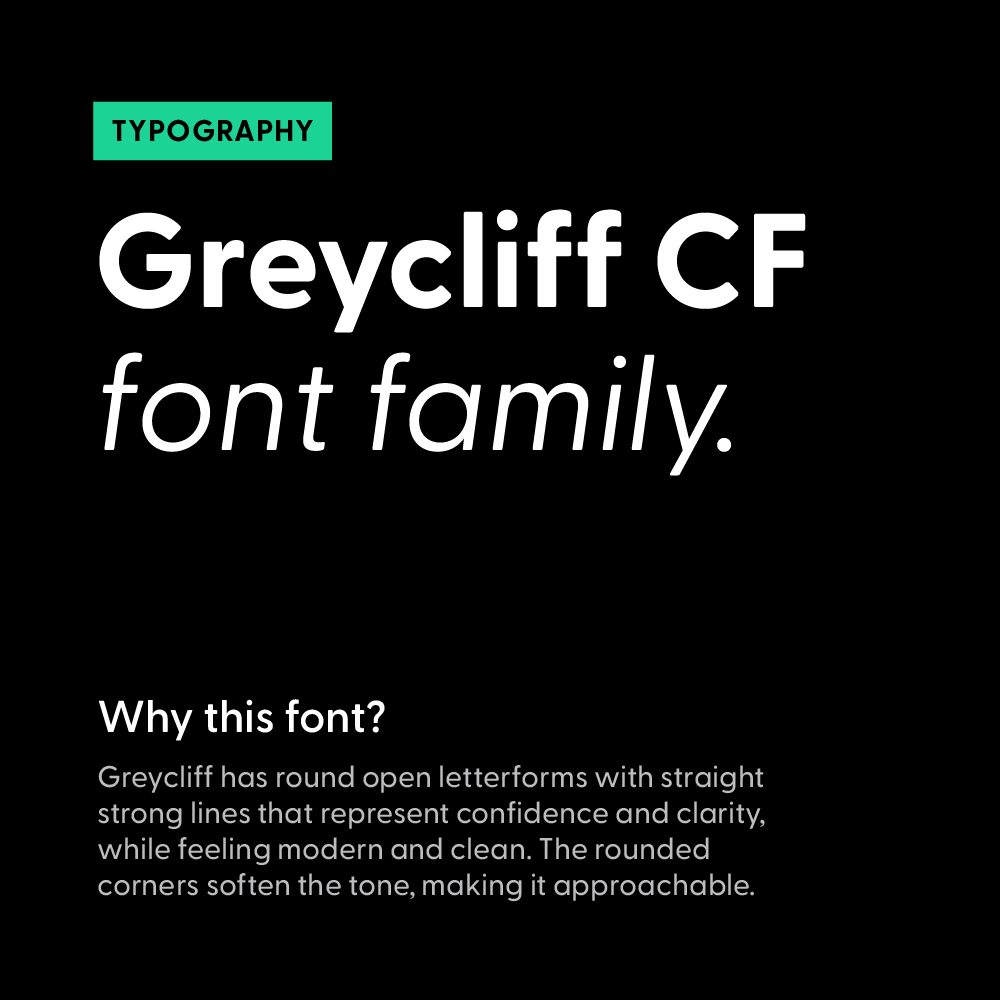
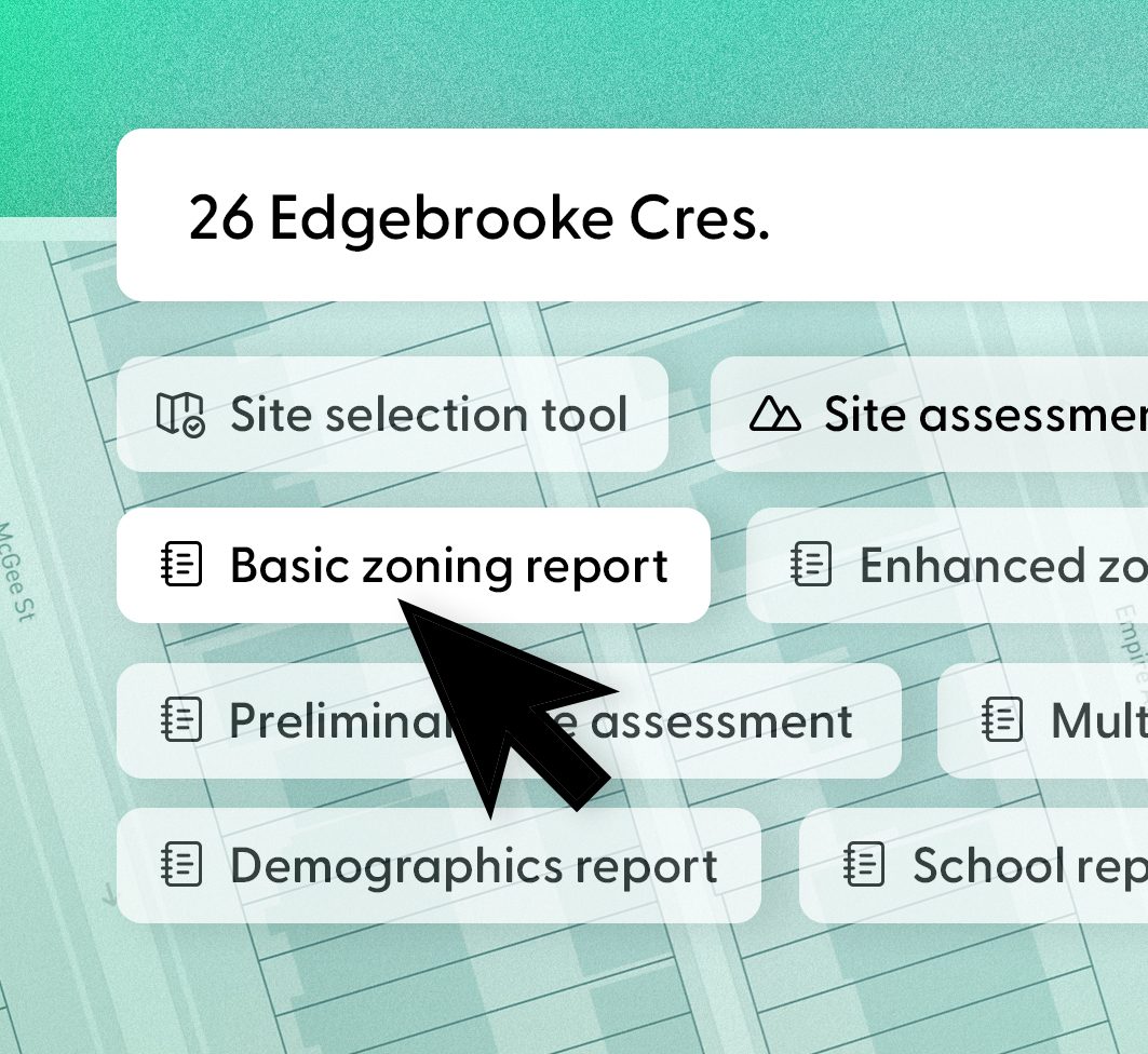
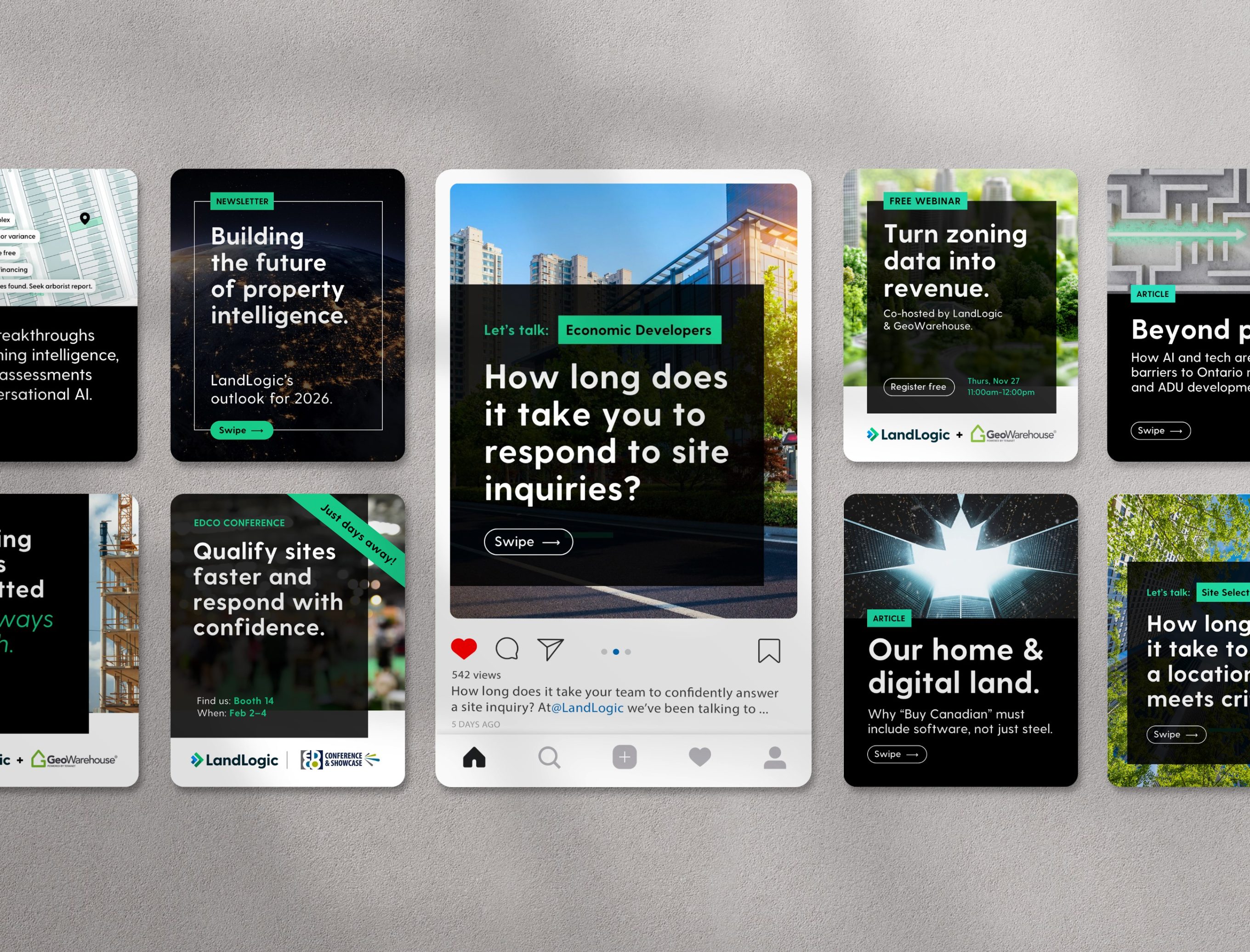
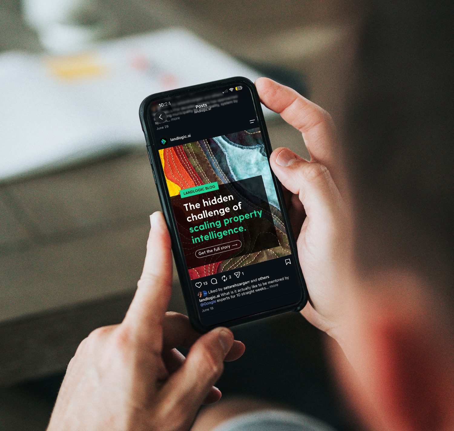
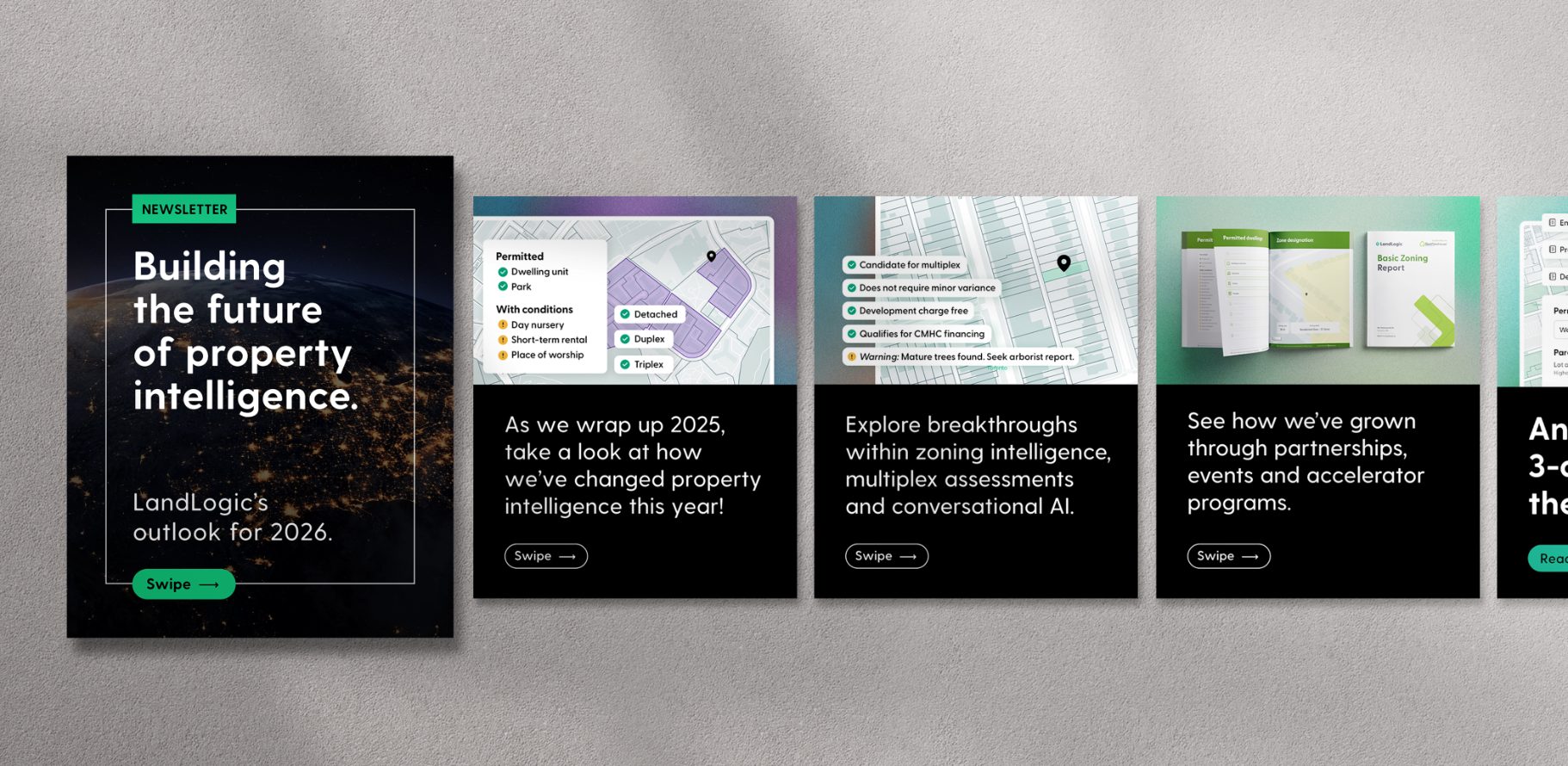
The social assets allowed me to exercise what the brand really could do. Colour blocking, big typography and clear labelling helped keep a consistent tone. I created dynamic social templates to keep content fresh but easy to produce quickly. I also managed and rolled out the messaging, social planning and campaigns.
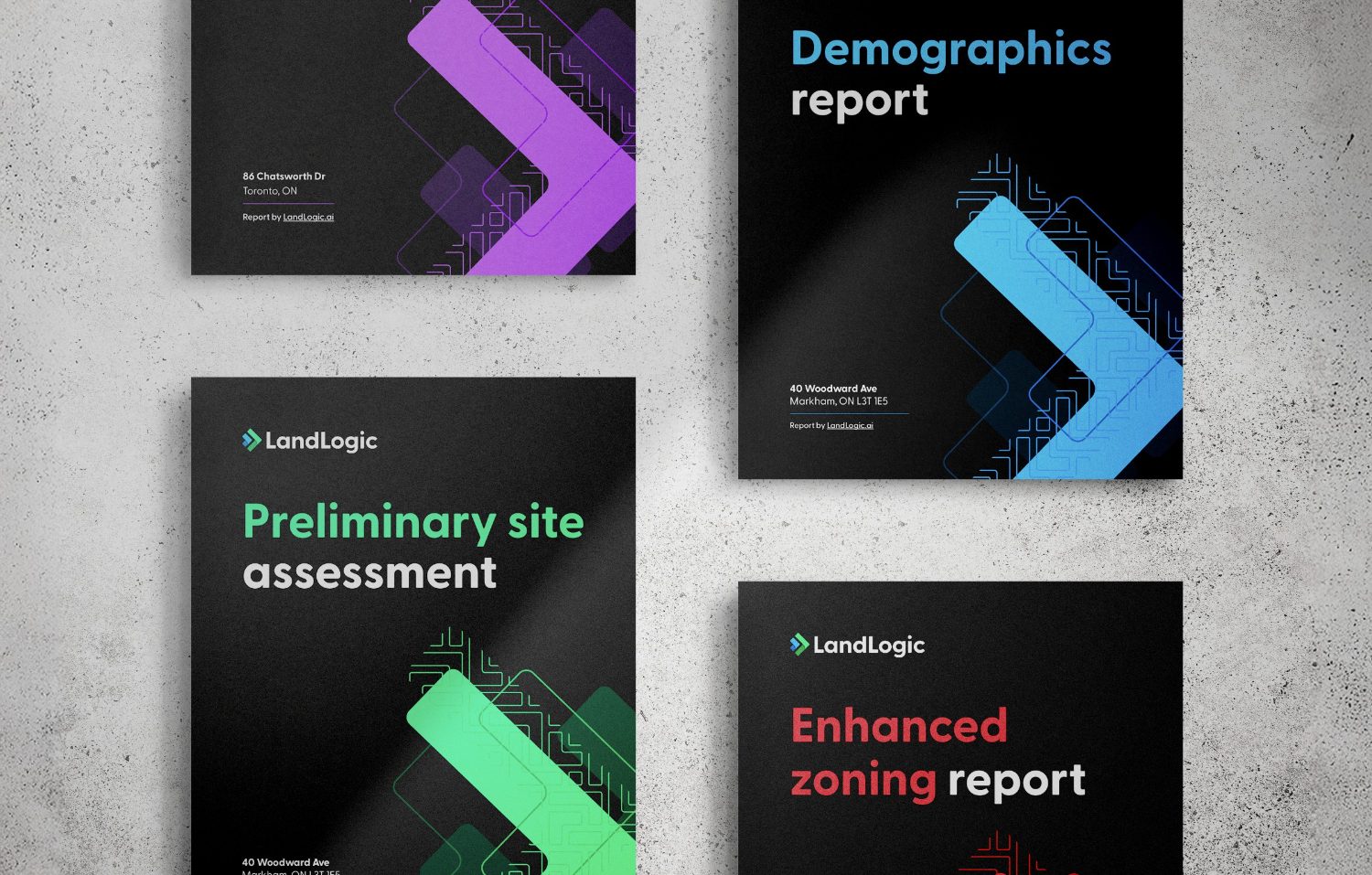
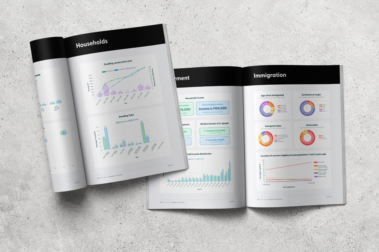
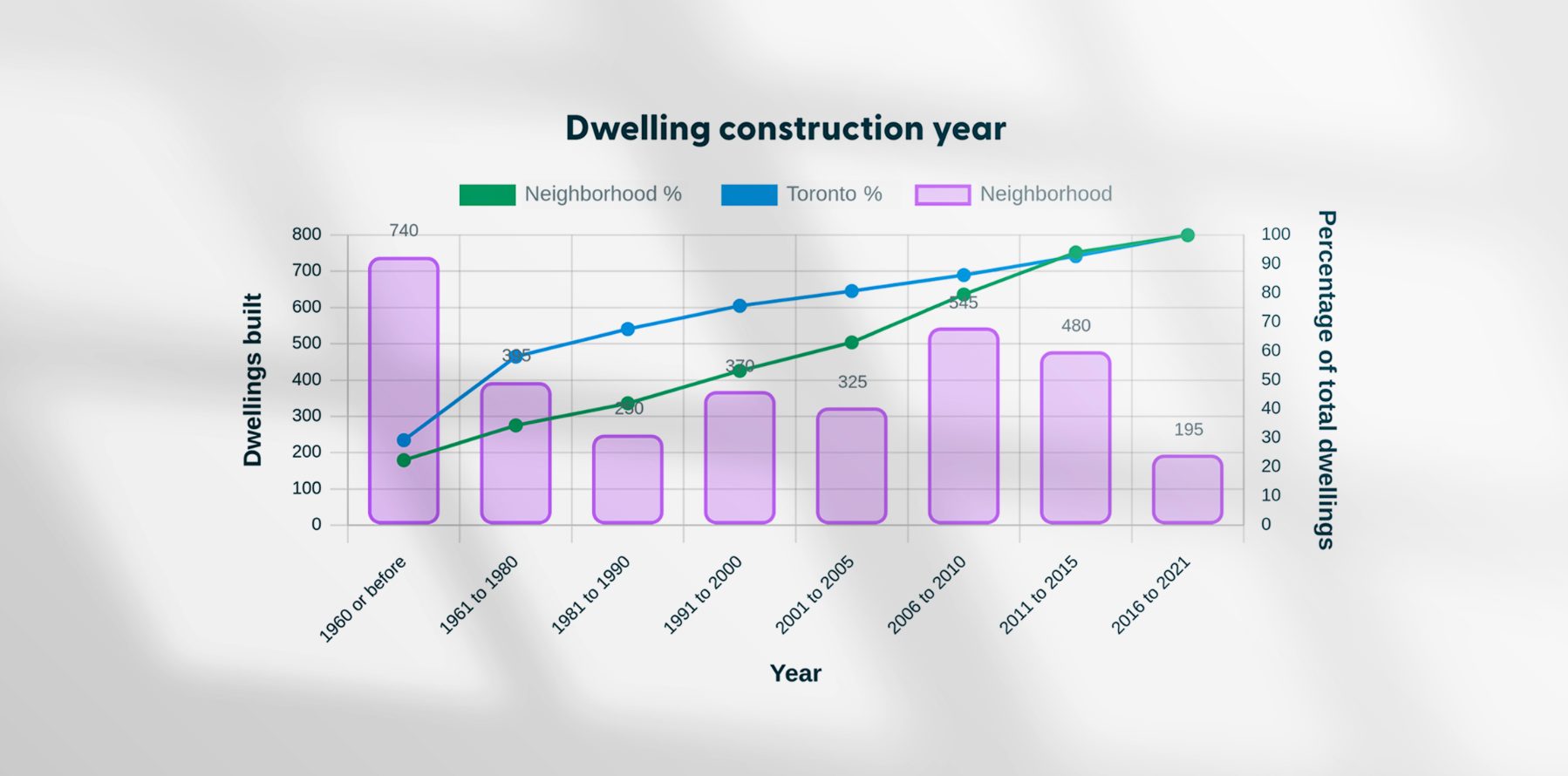
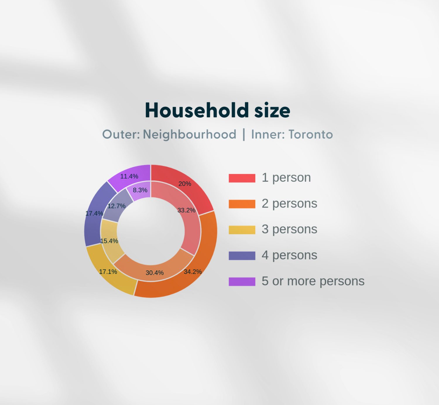
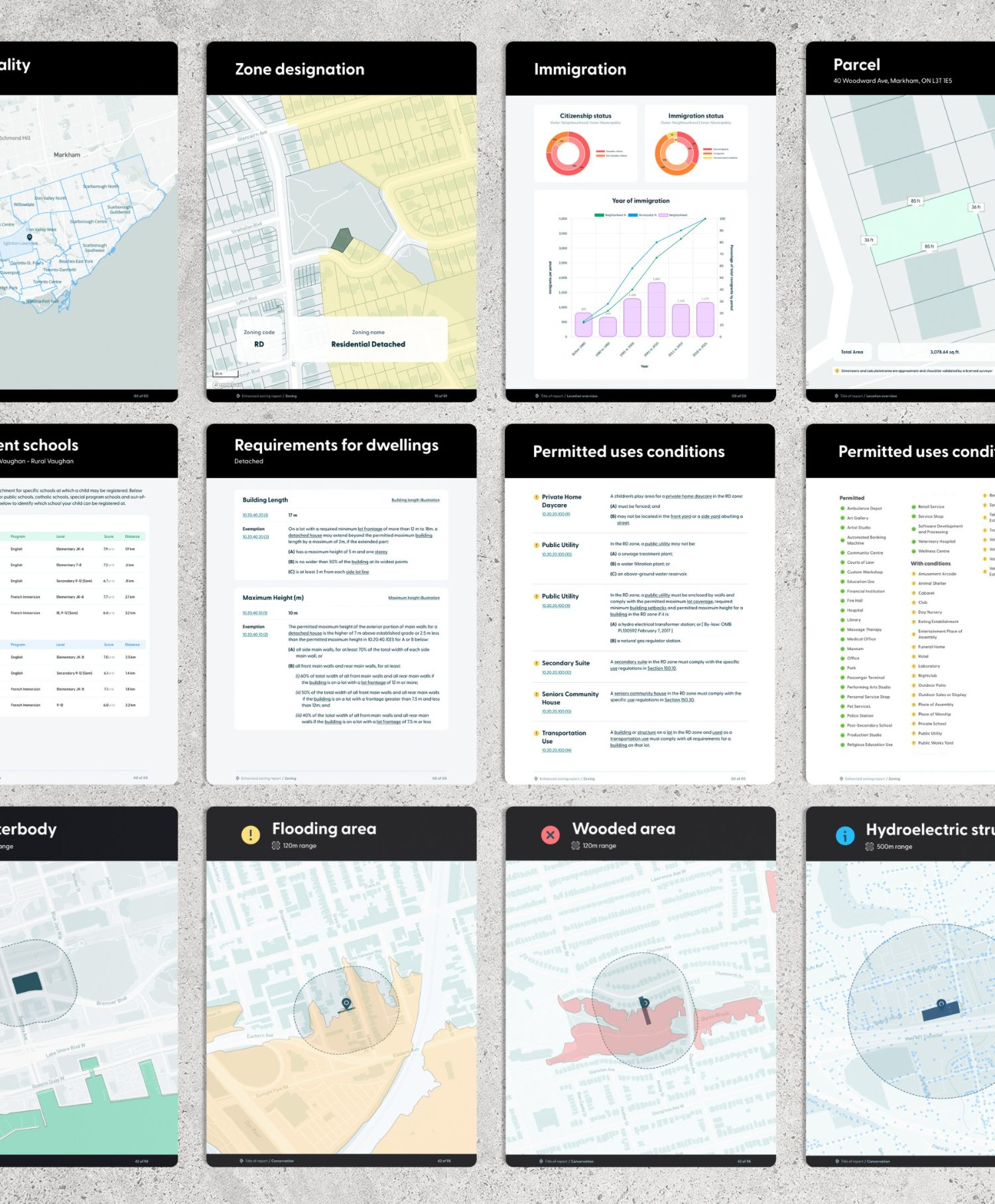
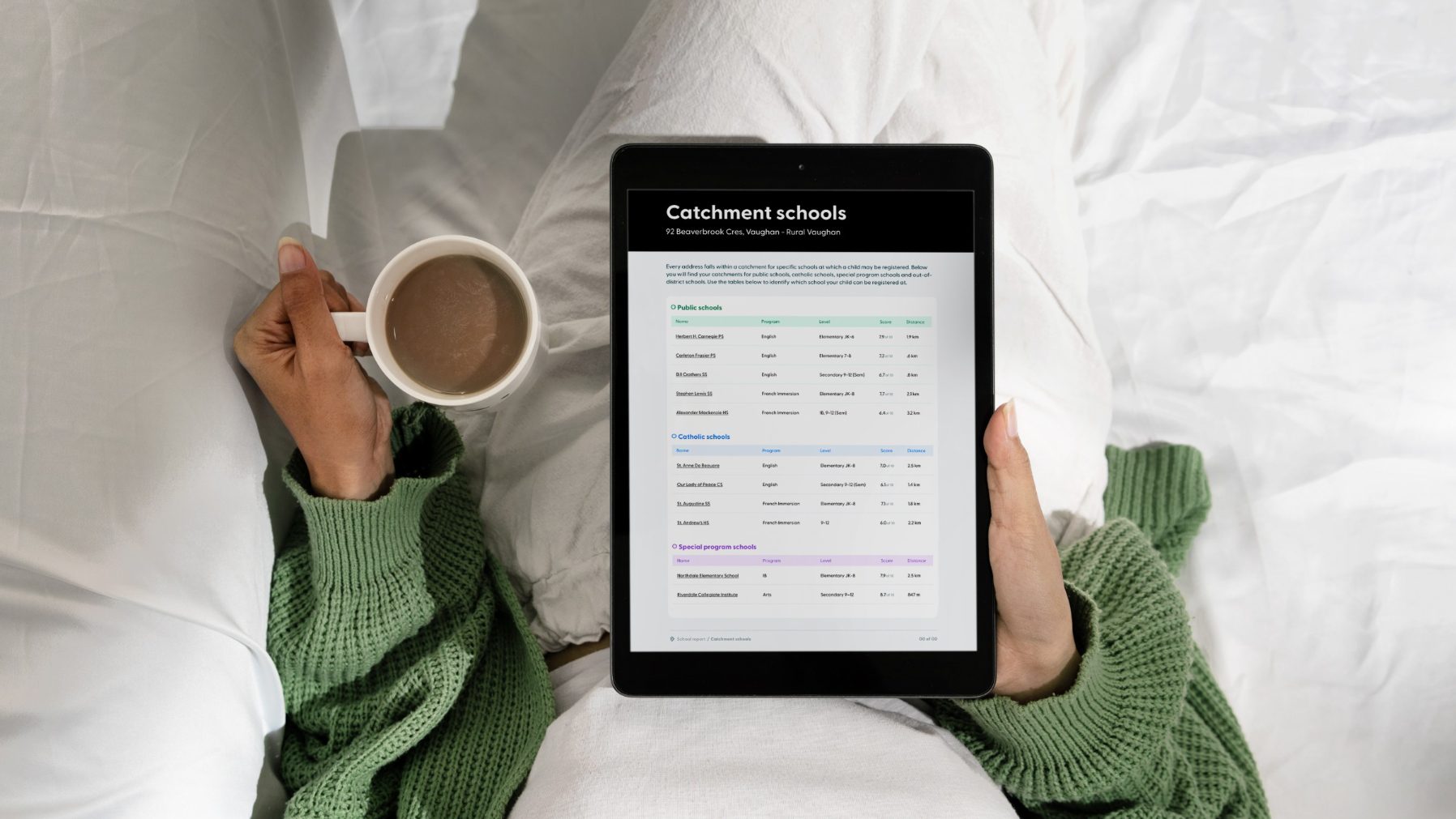
LandLogic offers complex live-data reports for its users. These are content heavy and required careful information layout to ensure clarity. The design made use of secondary colours, graphs, mapping, tables and clear editorial layout. I worked closely with developers to ensure designs were compatible with the constraints of the automatic generation tool.
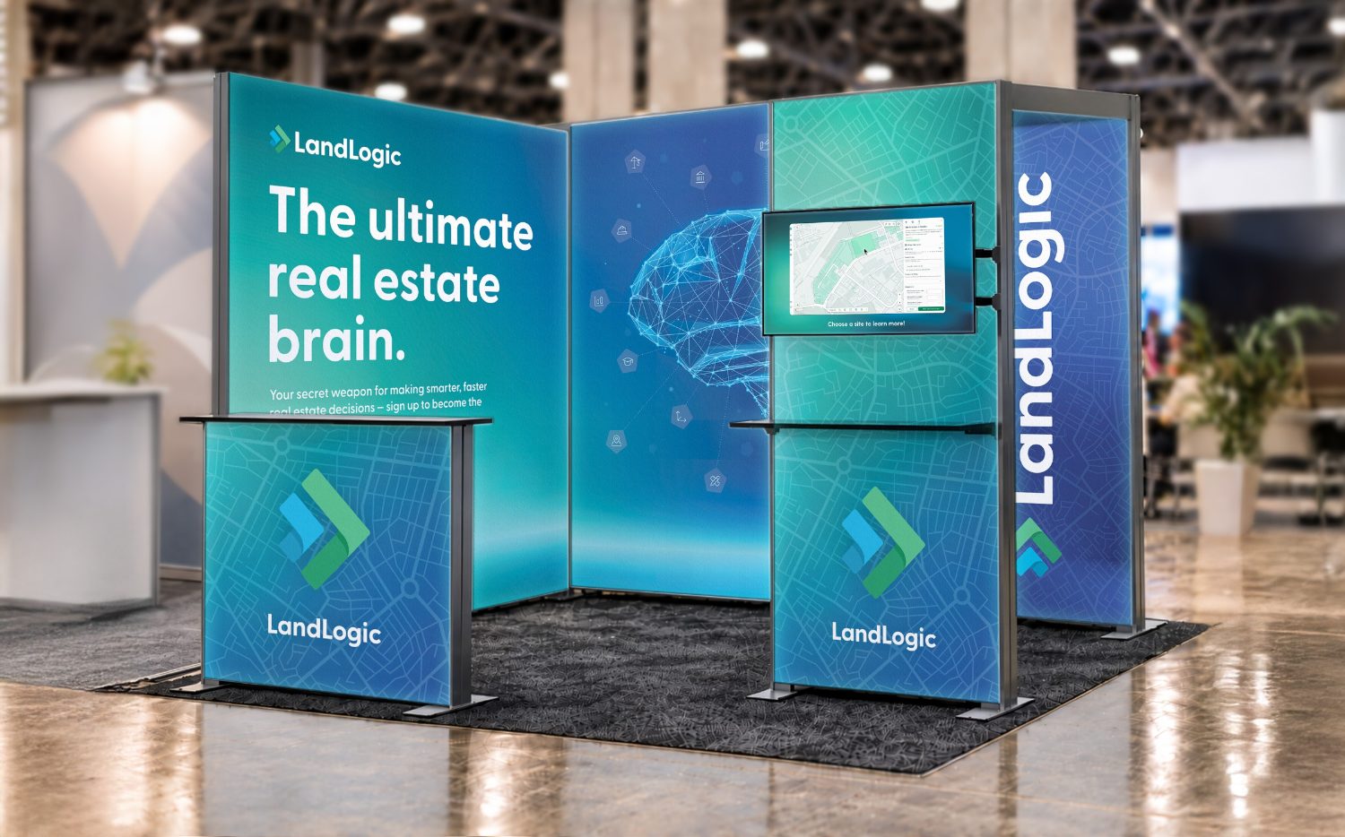
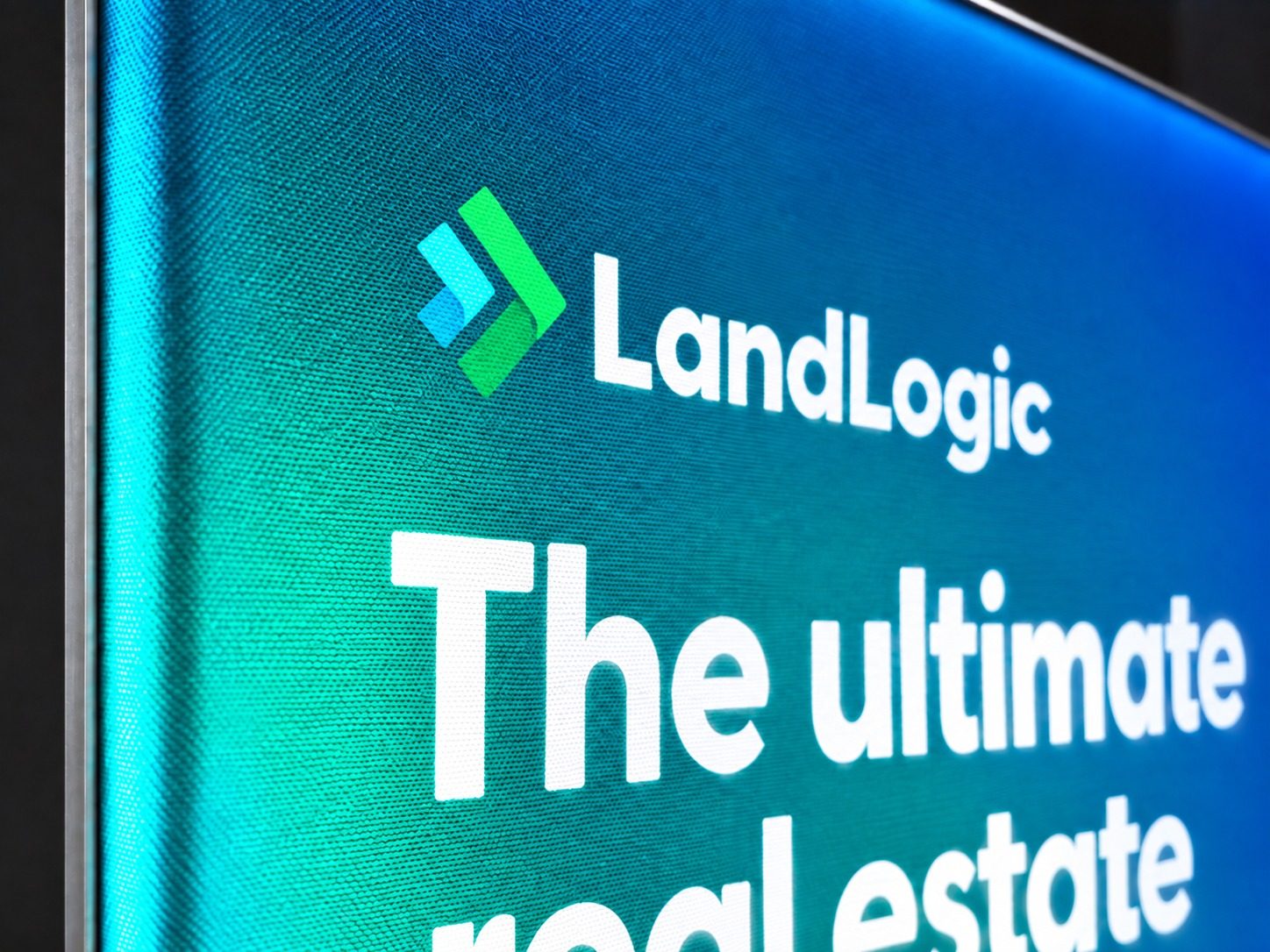
When it came to trade shows and conferences, we wanted LandLogic to really stand out amongst a sea of exhibit booths. I evolved the blue and green into a gradient to add more energy, and designed a modular backlit setup that would quite literally outshine the competition.
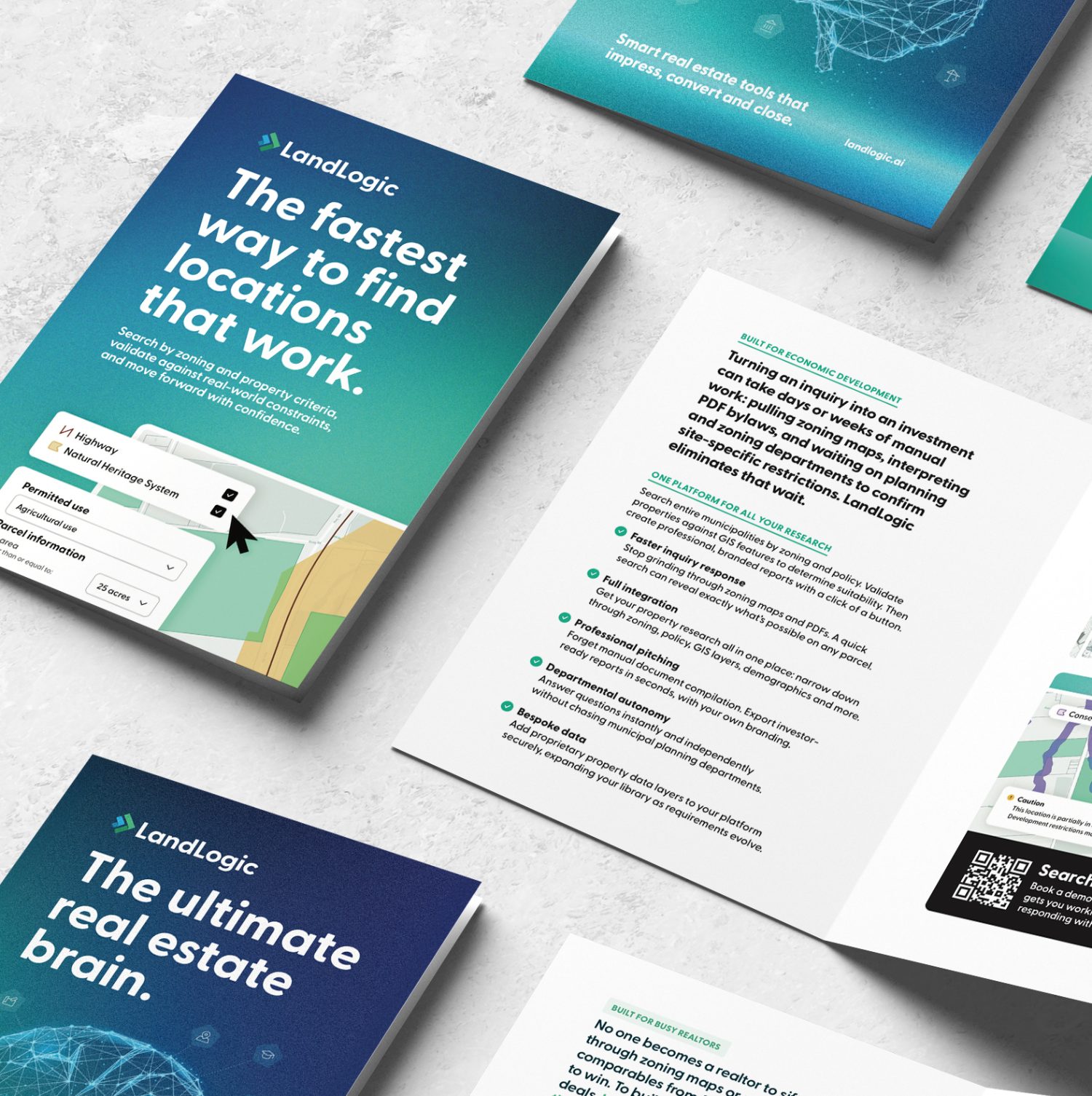
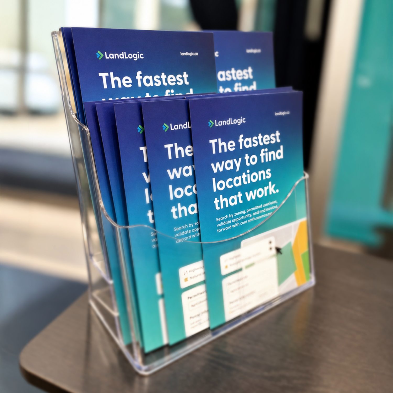
The booth is adaptable, as it can be re-used, repositioned and reprinted, depending upon the conference. Matching brochures and promo material made the booth a full brand experience.
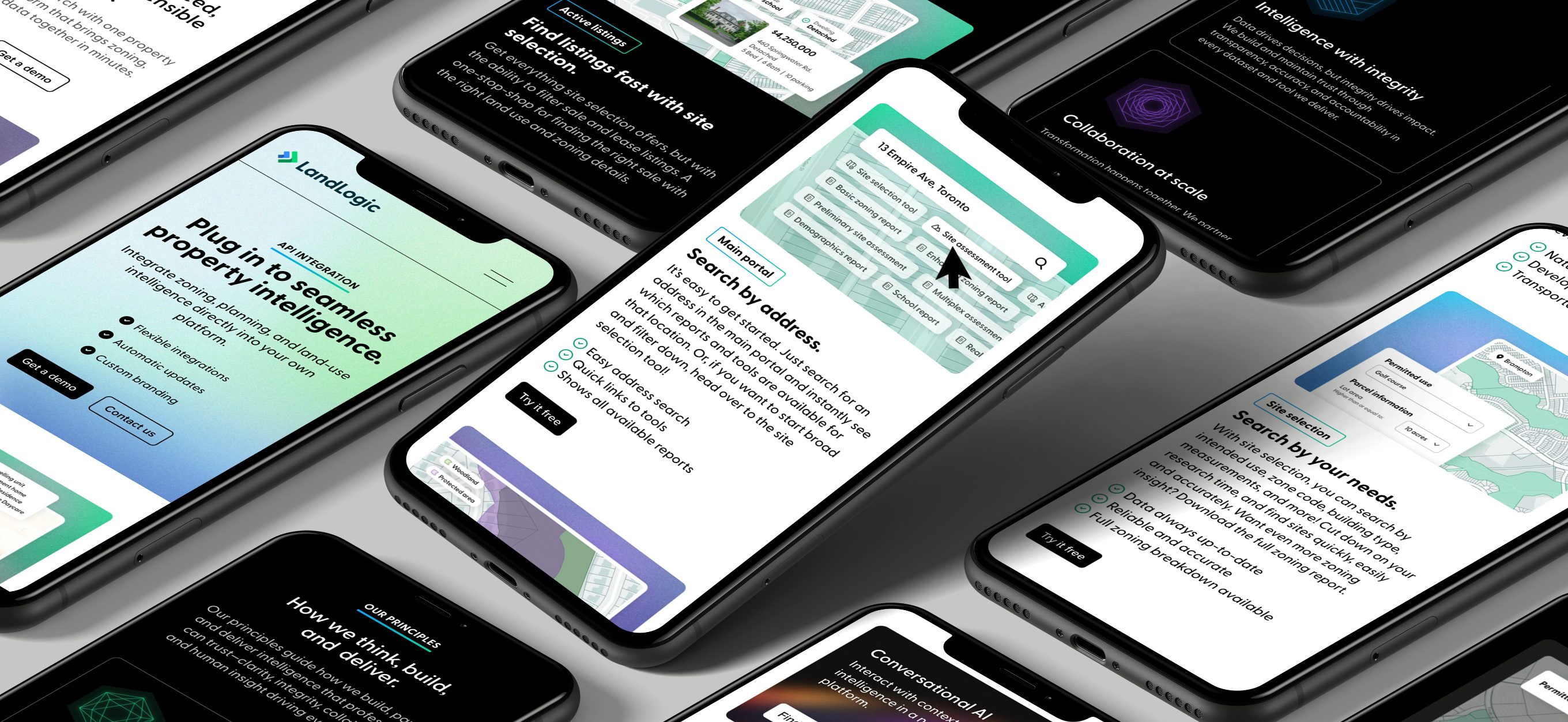
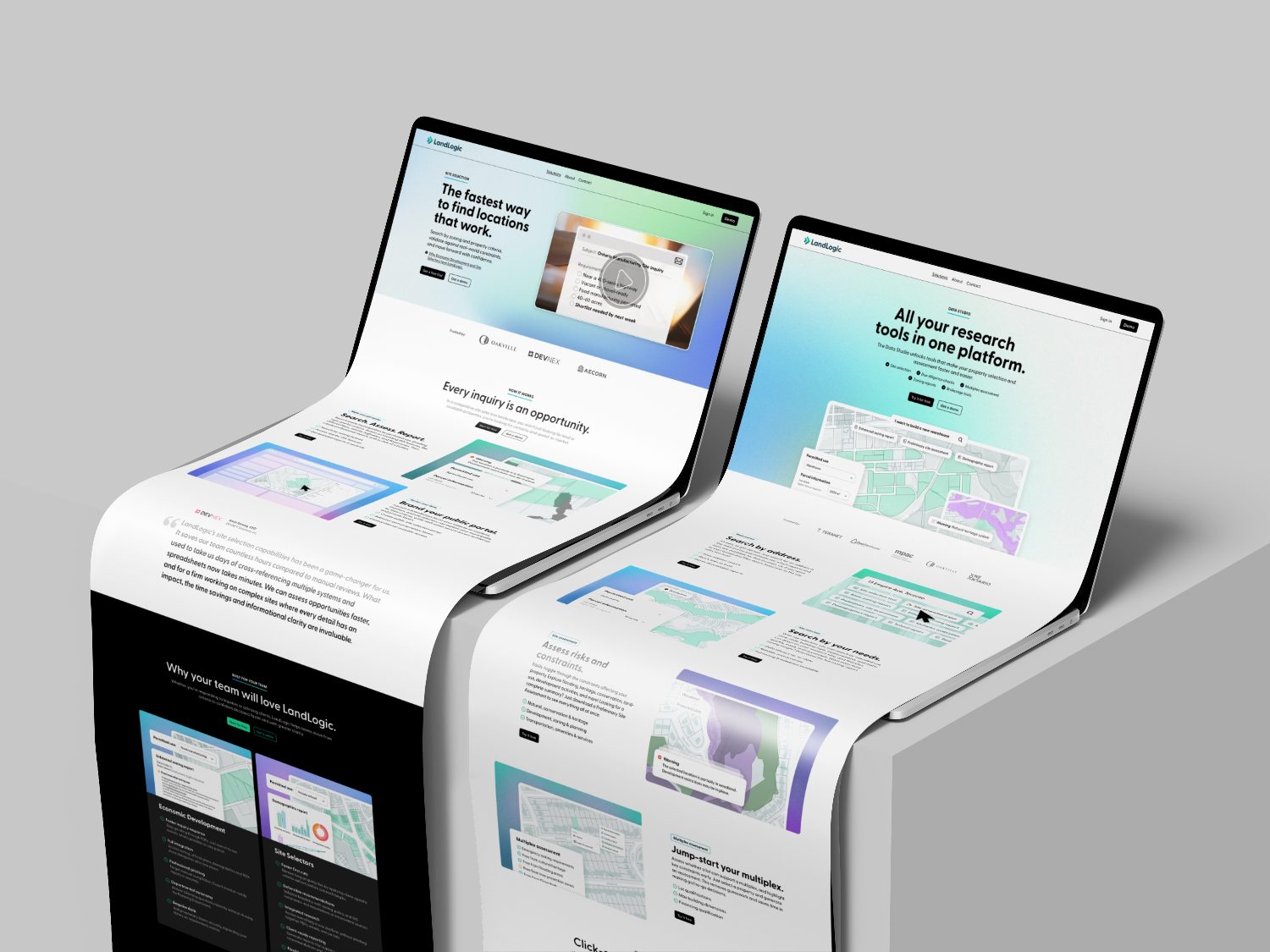
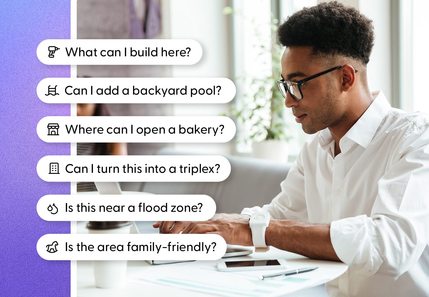
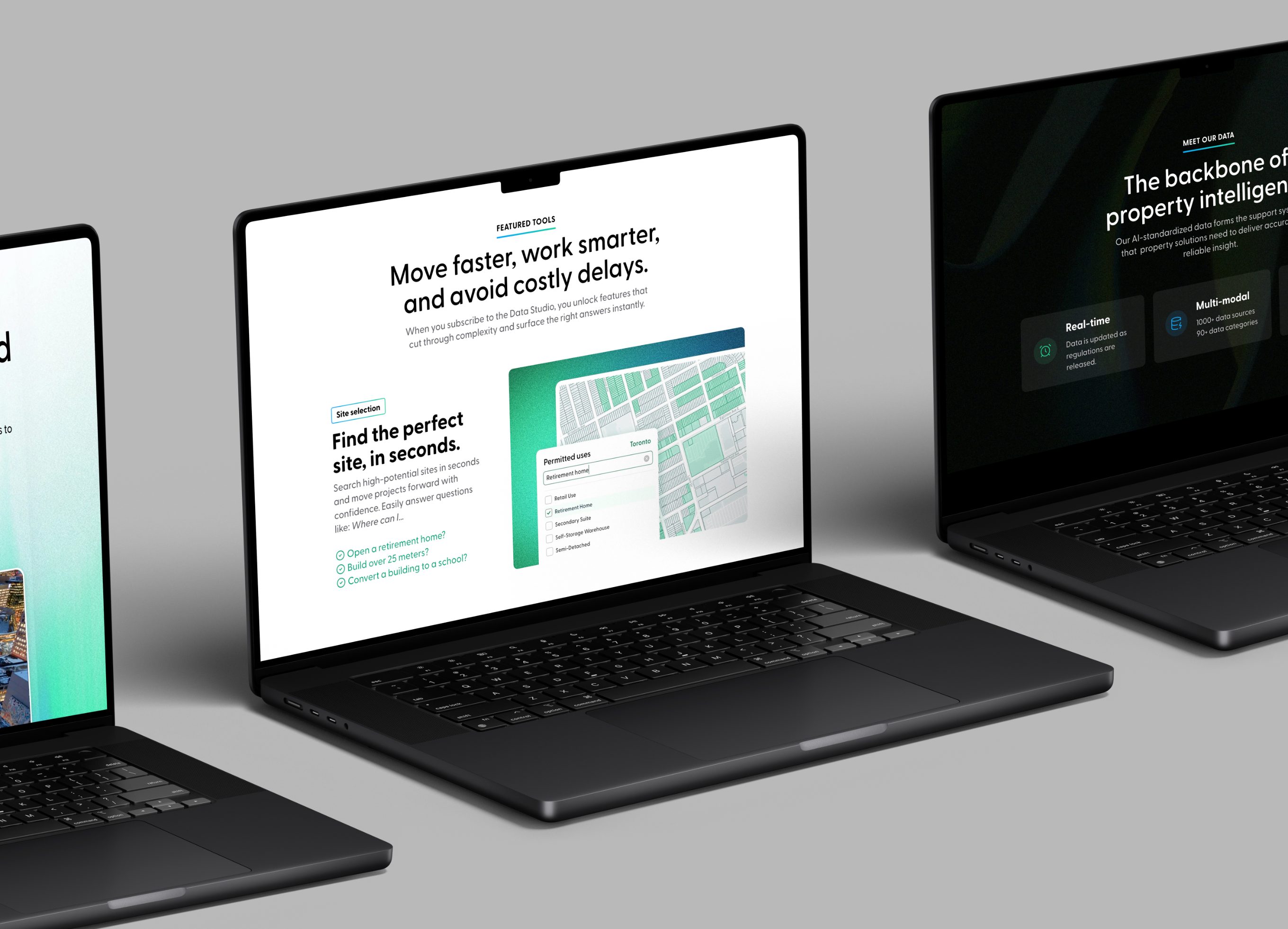
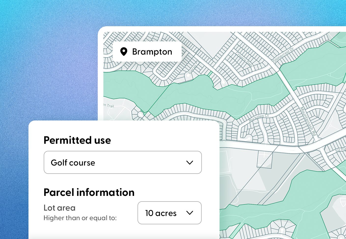
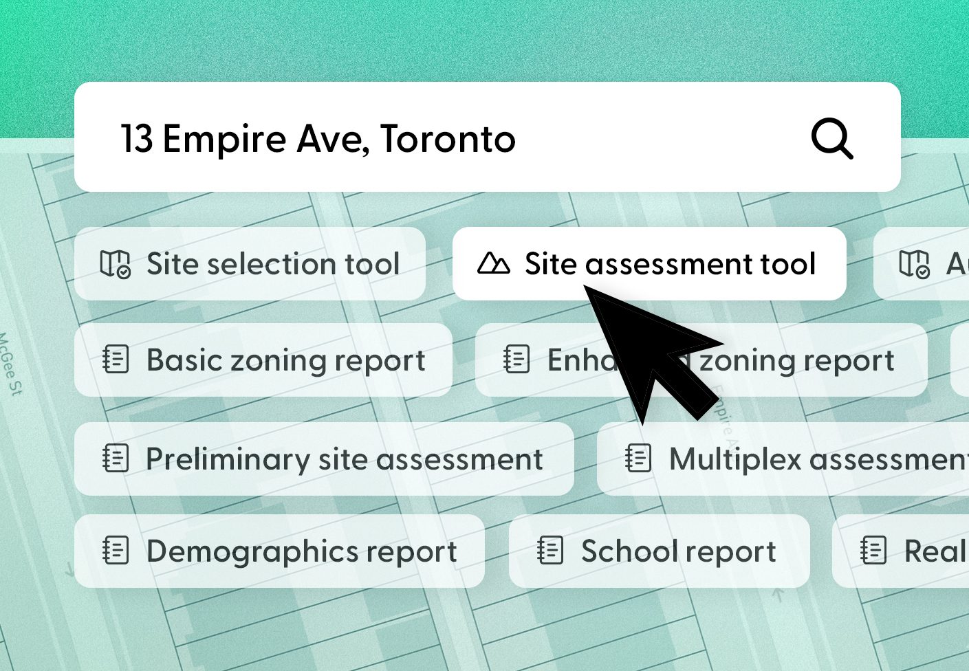
To compete with the top SaaS brands out there, the LandLogic website had to be sleek, bold and energetic. With a range of dense subject matter to cover, a clean layout and clear messaging was key. Large headings, careful information hierarchy and fresh product imagery got the message across. I brought in textured gradients in a range of primary and secondary colours to support the extensive product imagery.
I developed the site structure, wrote all the content, created all the imagery and published the site without a developer (and without AI). I also managed SEO and AEO, wrote and updated the blog, and reviewed analytics and performance to keep the site optimized.