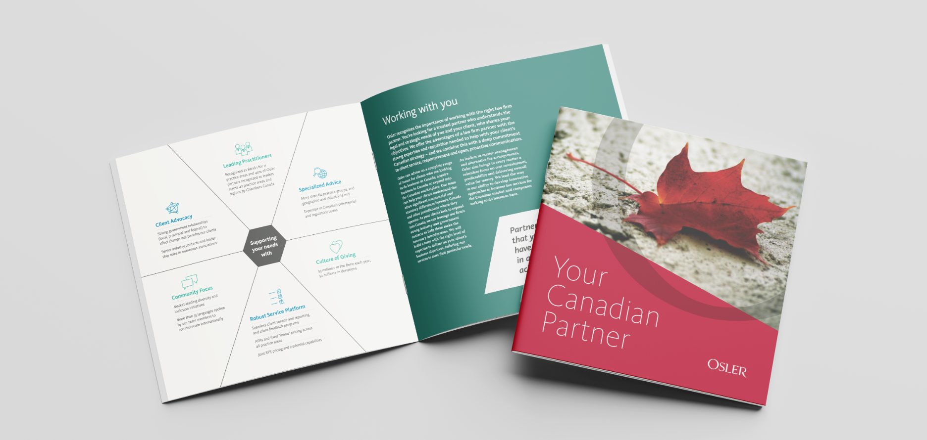
Crafting a powerful brand system.
While working at Zync Agency in Toronto, I was the lead designer for our work with Osler. When I started on the project, they had just finished a brand refresh. So concepts were approved, but none of the details or brand rollout had begun. I had the bare bones of a brand, and my job was to develop and refine it into a very tight, very controlled system that could be used globally.
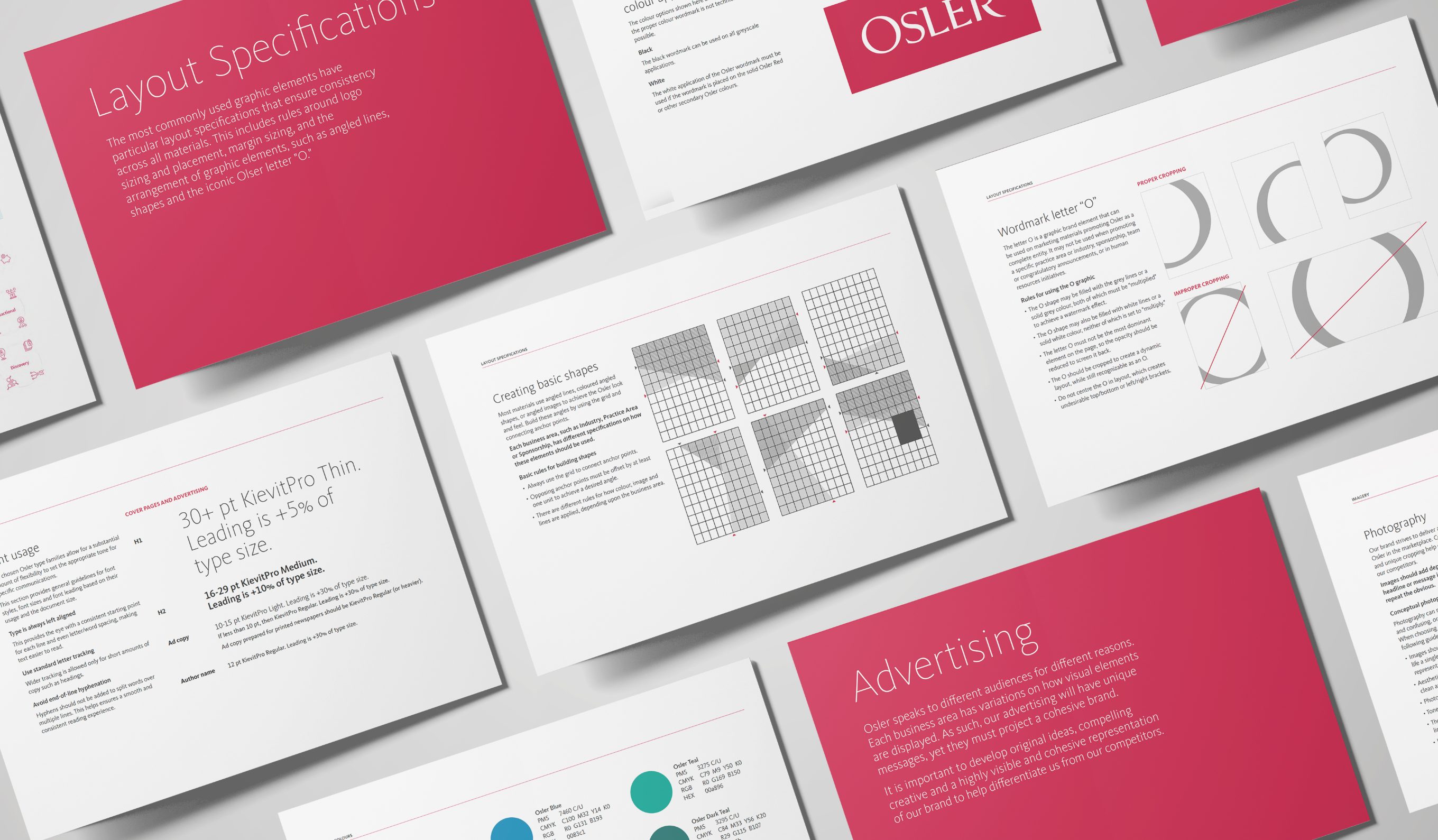
One of the most important pieces of the project was creating a very comprehensive brand guidelines document. Consistency across materials was extremely important. It needed to cover every base, every variation, and every possibility that the Osler brand might encounter.
Because this was a totally custom job, I spent weeks creating detailed rules around logo size formulas, systems for creating the brand shapes, calculations for how to measure precise margin sizes, where to use what weight of fonts, and so on. Every ad, every report, every brochure needed to look consistent.
This was the most comprehensive brand system I have created, and because I was the lead designer on this brand for over two years, I pressure tested my own system daily.
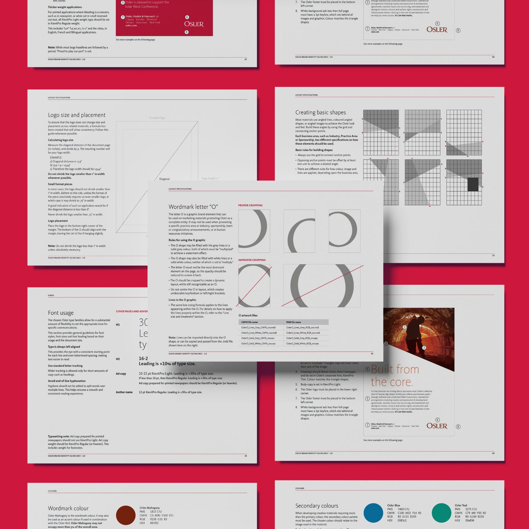
One of the main applications of the brand was in Osler's print and digital advertising and communications. Osler is also involved in a breadth of sponsorships and events throughout the year, and shows its public support through magazines, newspapers and digital ads. The design system was key to ensure consistency between the hundreds of published materials.

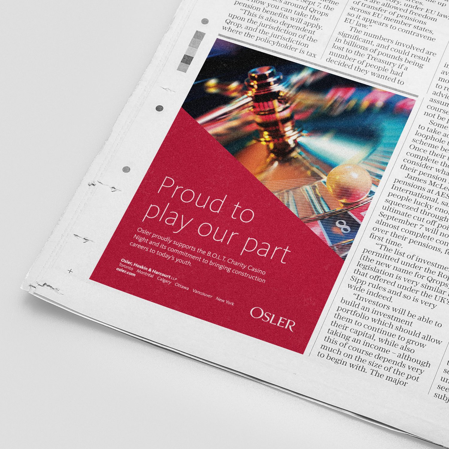
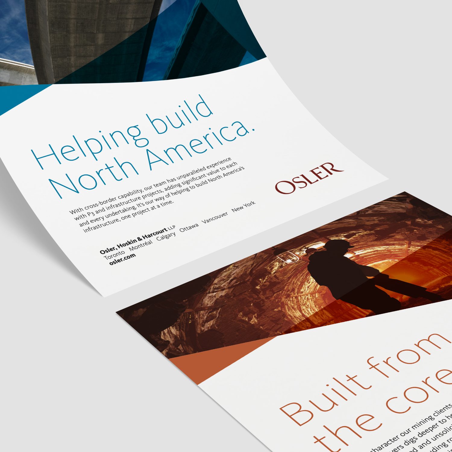
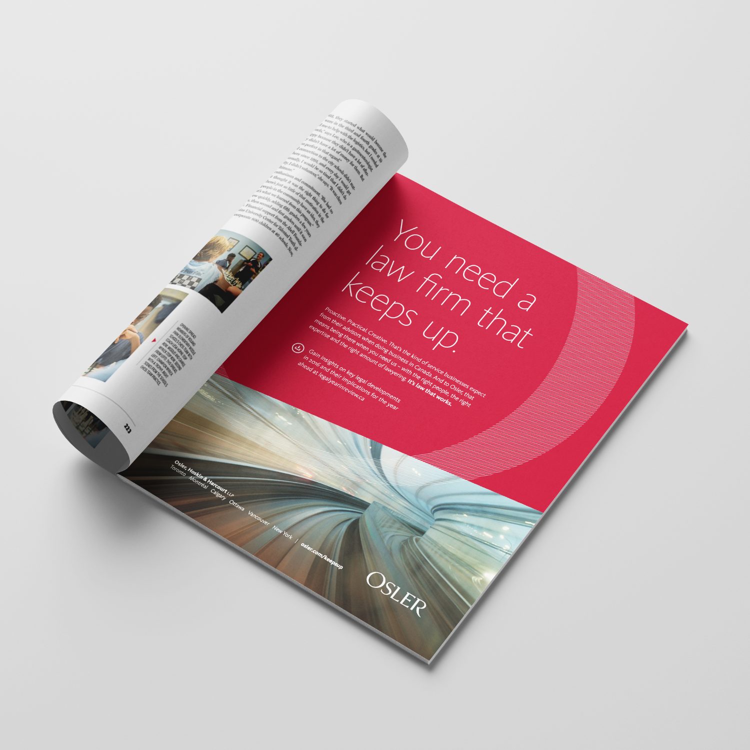
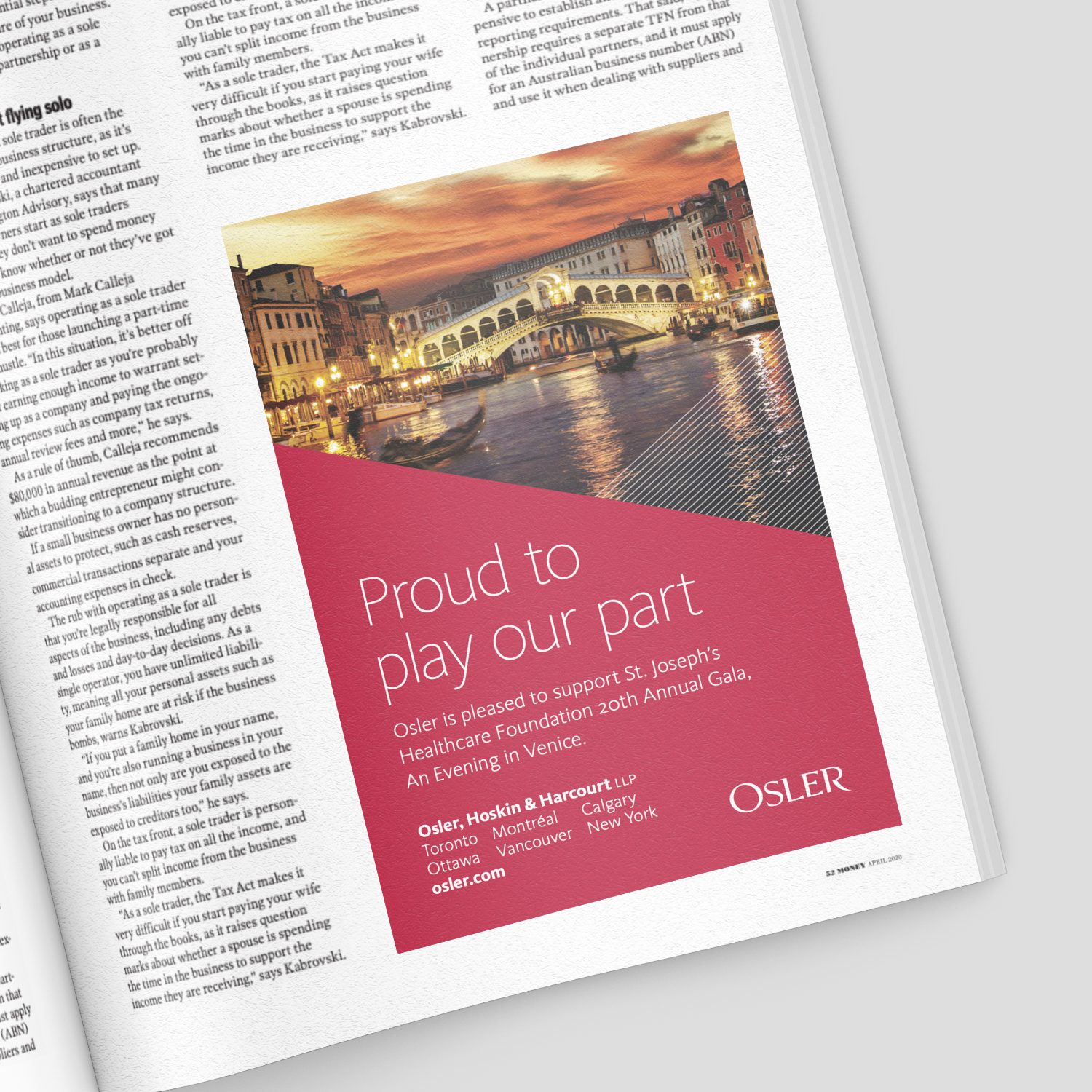
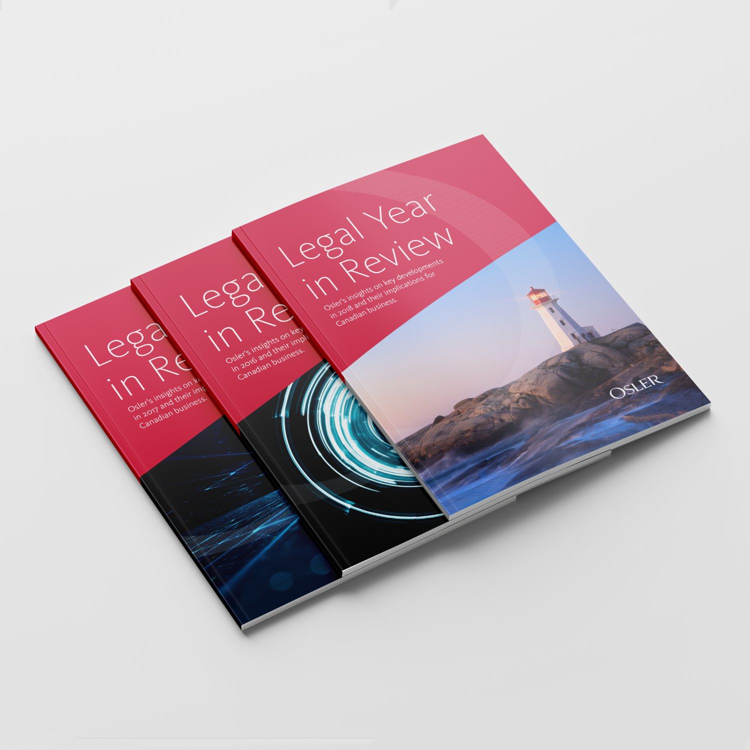
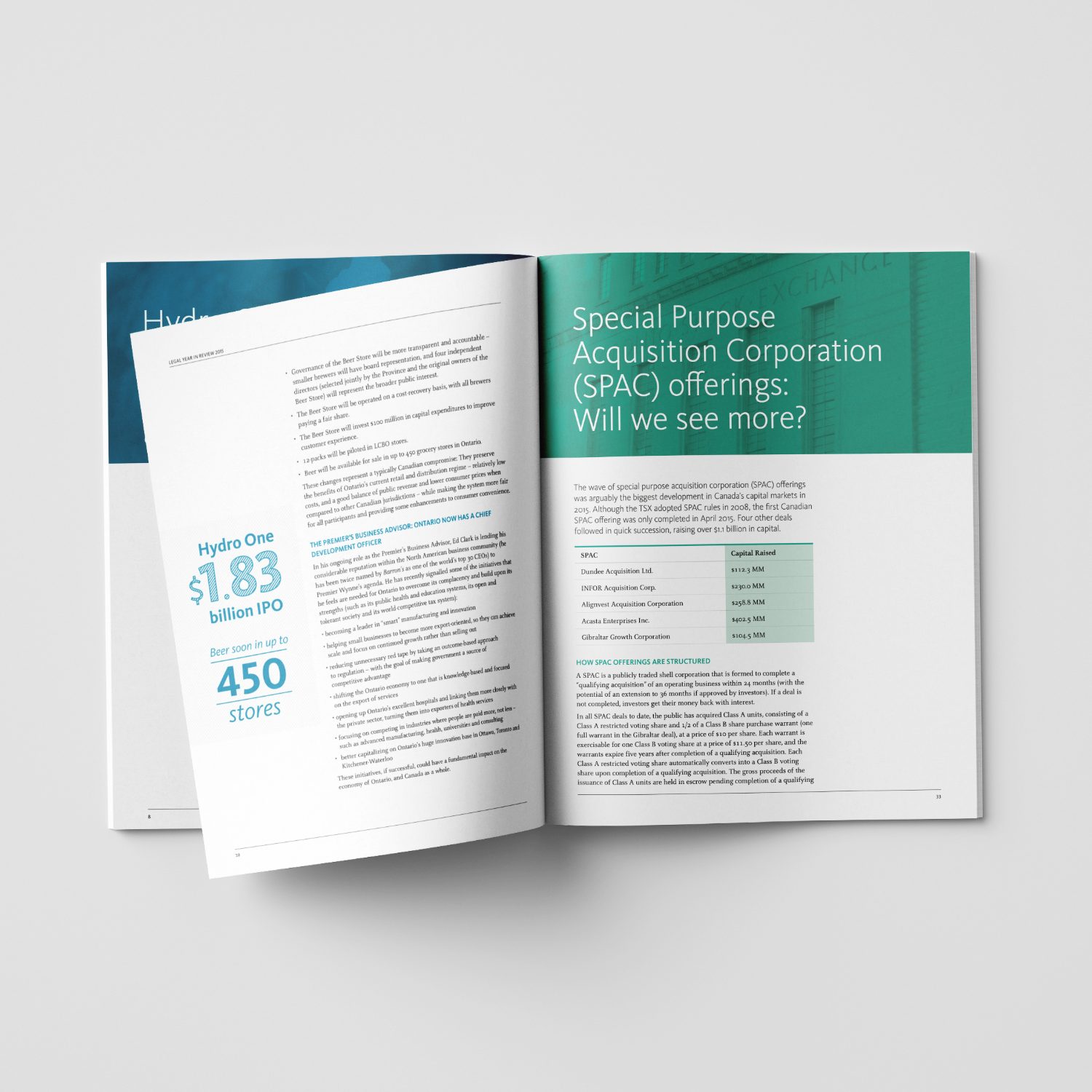
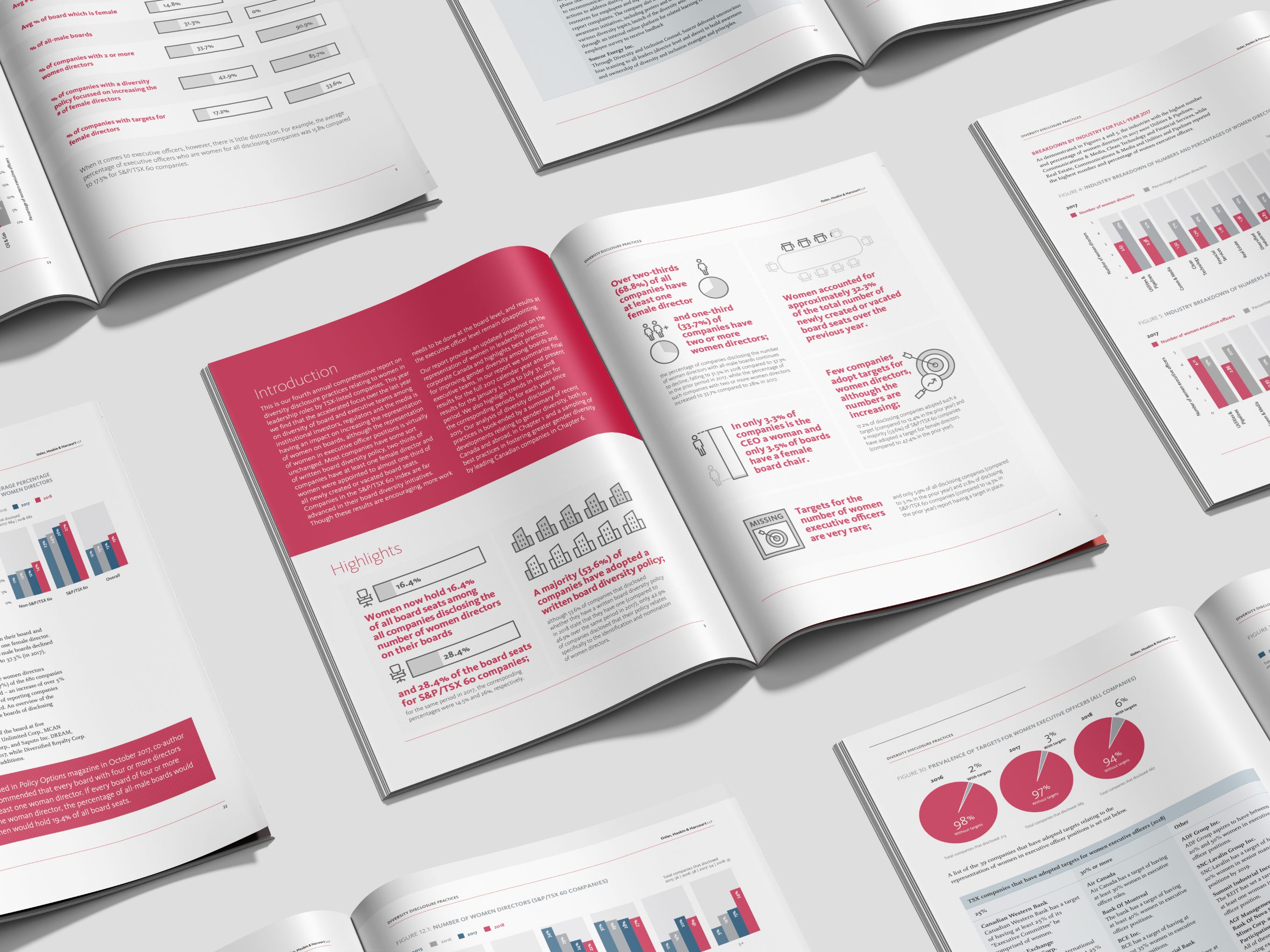
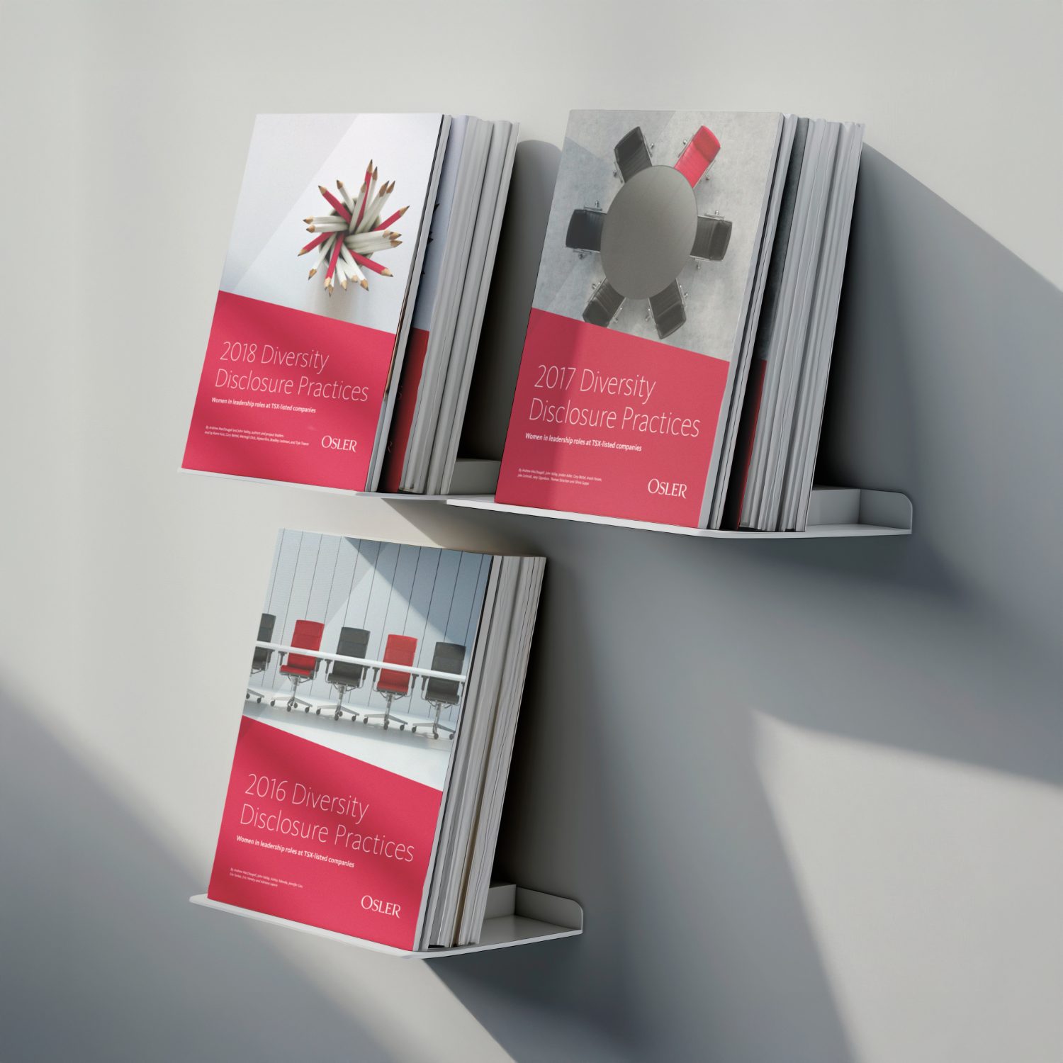
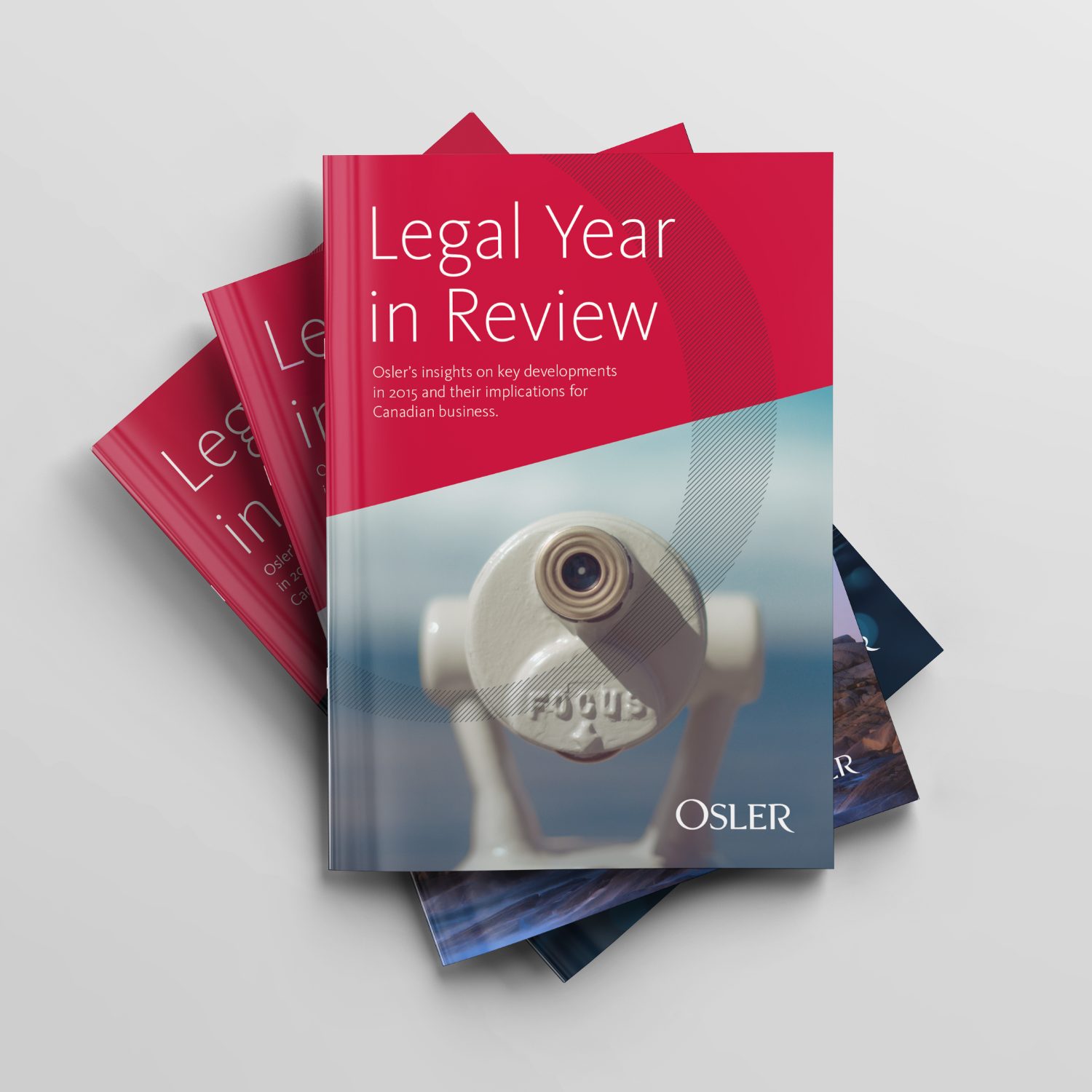
Osler is a titan in thought leadership, and produces dozens of publications a year for its global audience. These pieces are long-format, text heavy, industry-specific pieces. Layout, information hierarchy and organization within each publication is key. I created layout standards and detailed typesetting styles for consistency between publications from year to year.