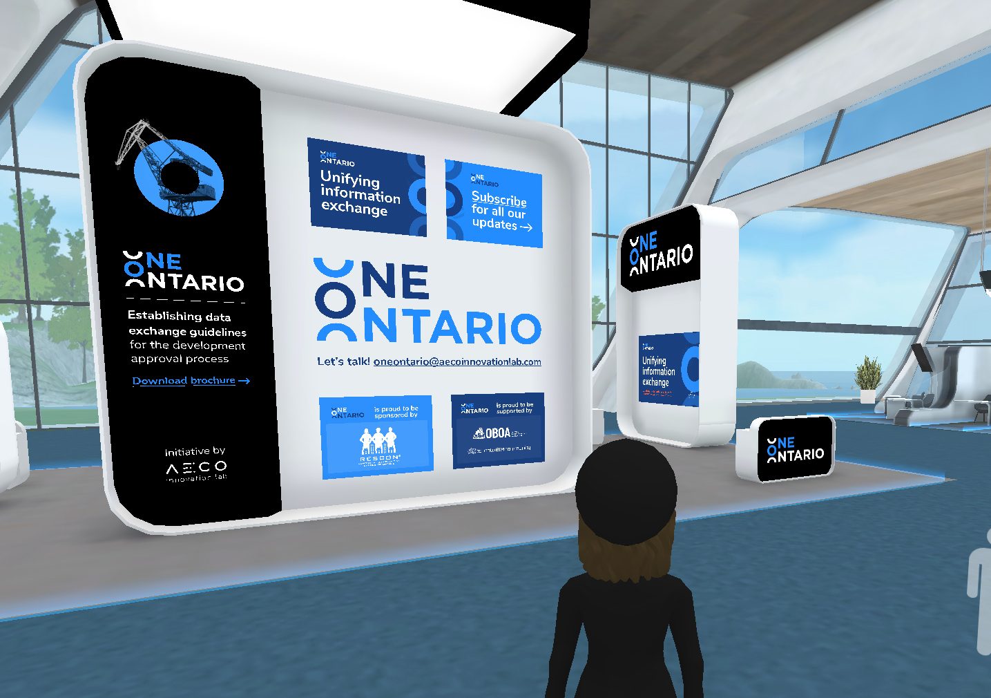
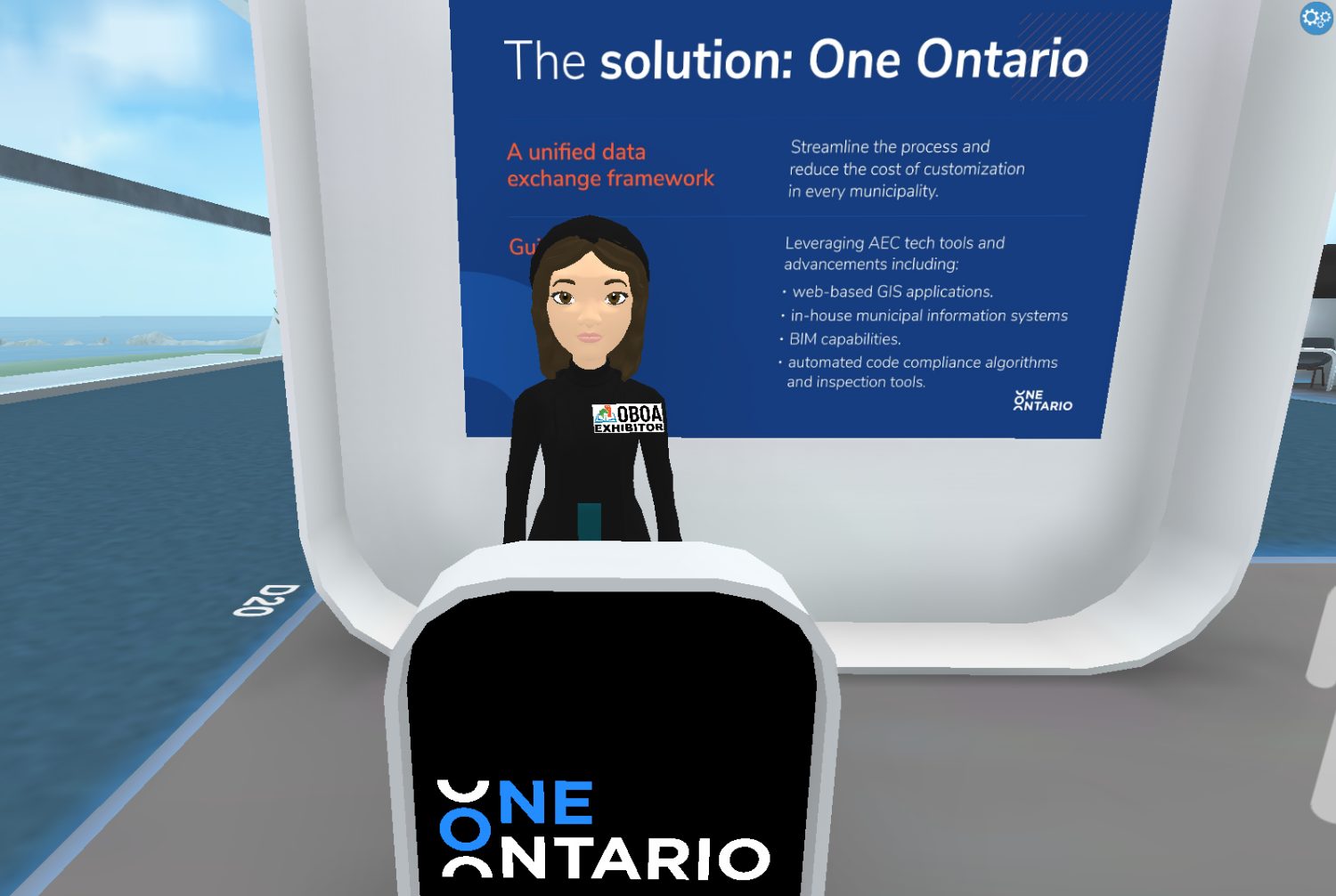
An identity for a modern Ontario.
One Ontario was one of the venture startups that came out of AECO Innovation Lab. The goal of the organization was to bring together government, academia and industry to modernize how Ontario approaches development approvals, and therefore improve housing supply. My job was to develop the full brand identity, roll it out and manage the brand over time.
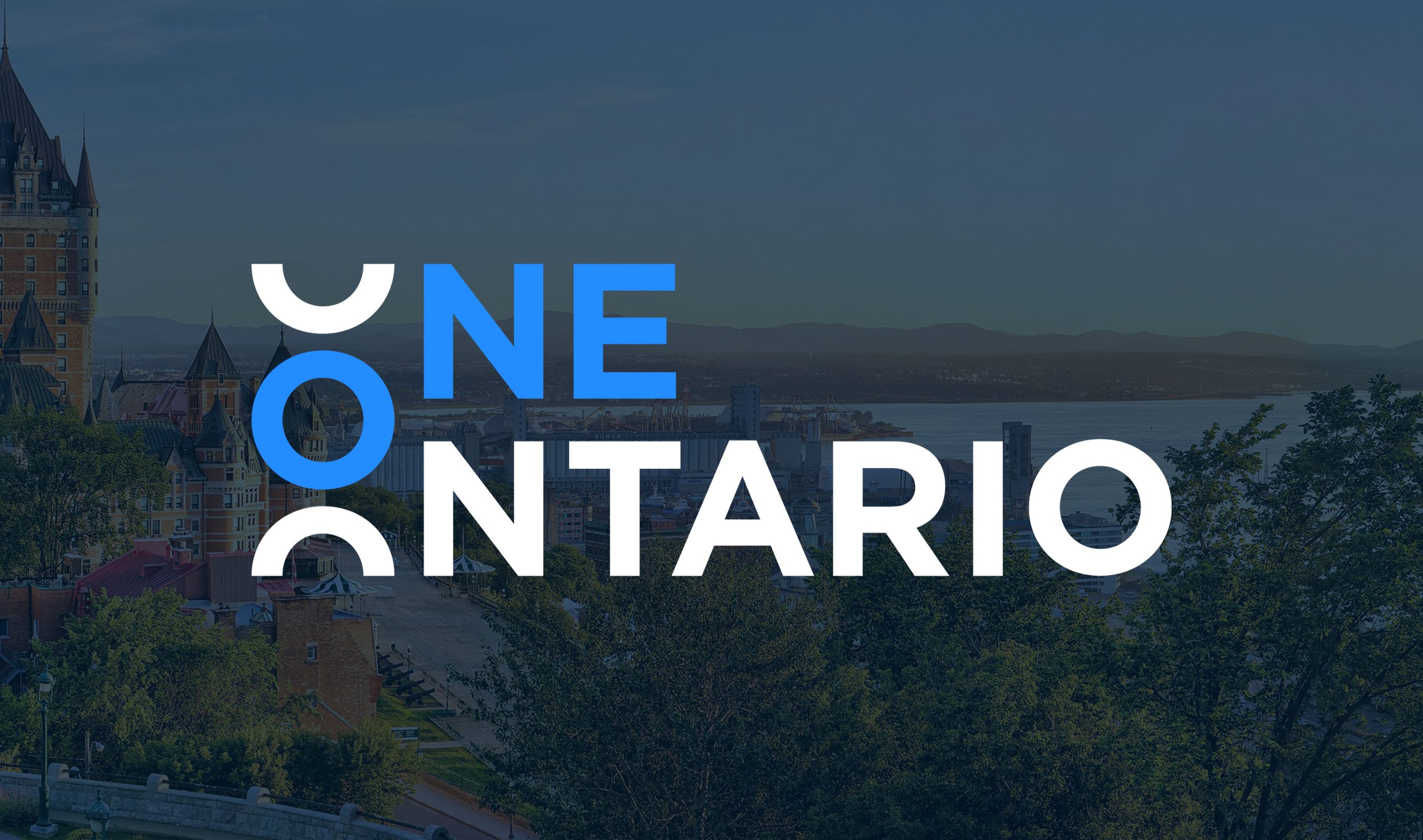
One of the challenges of developing this brand was the positioning. We wanted to make it fresh and digital, but also appeal to government and academia. It needed to walk a fine line between modern and traditional. I spent many sessions defining goals, researching competitors, understanding what the audience was typically used to, and conceptualizing how far we could "push" the sector without overstepping.
Because I was responsible for developing this brand in-house, I worked closely with stakeholders and the audience to find the right balance in tone. For the palette we landed on blue tones to represent calm professionalism, but added orange and yellow to inject a bit of energy and keep it fresh.
For the visual language I spliced apart the "O" from the logo into various shapes that could be organically rearranged to create endless layouts and make each piece very recognizable.

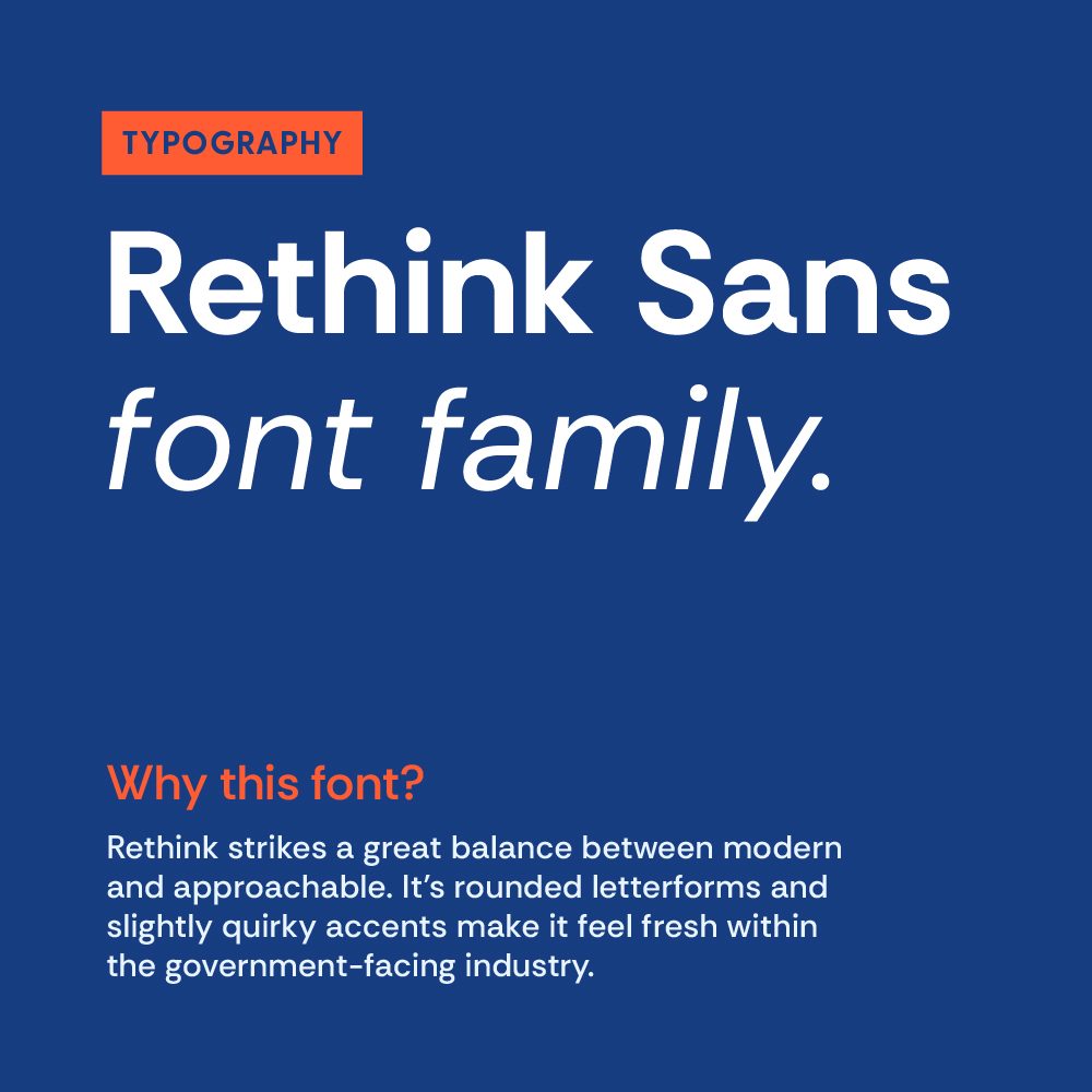

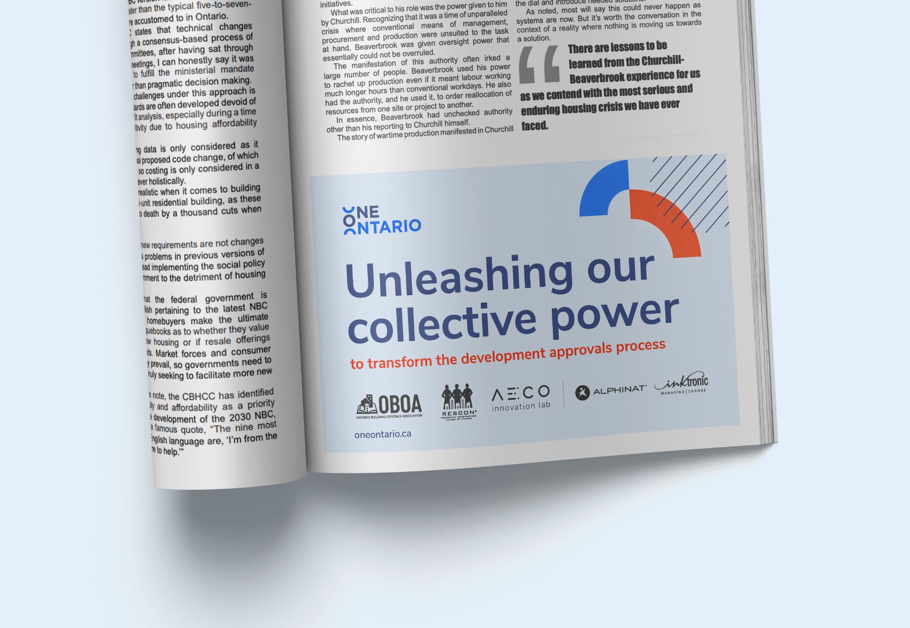
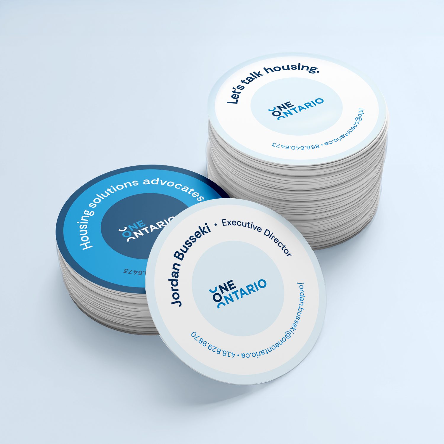
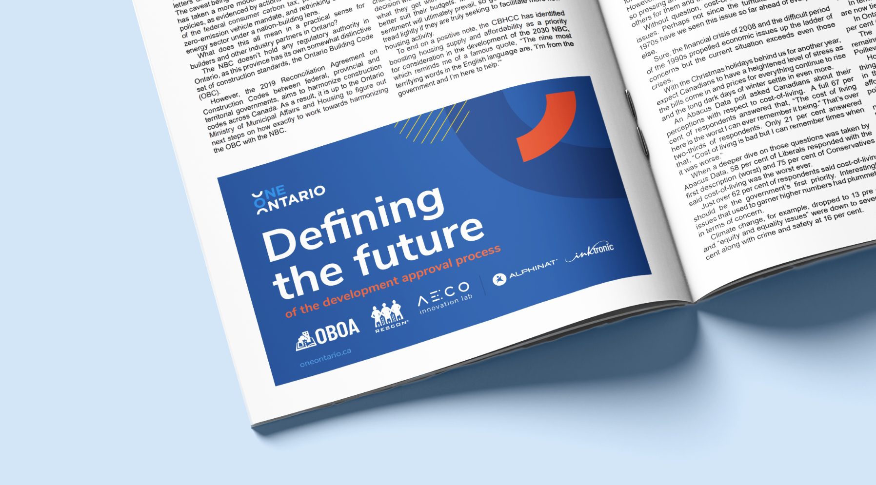
I worked with the team to define what types of materials would be needed to express the goals of the organization. I then started working on how to develop the brand across those materials. The flexibility in shape and colour allowed me to create endless variation between pieces, which creates visual interest while keeping every piece recognizable and consistent. The circle motif became a key repeated element, even on the business card shape itself.



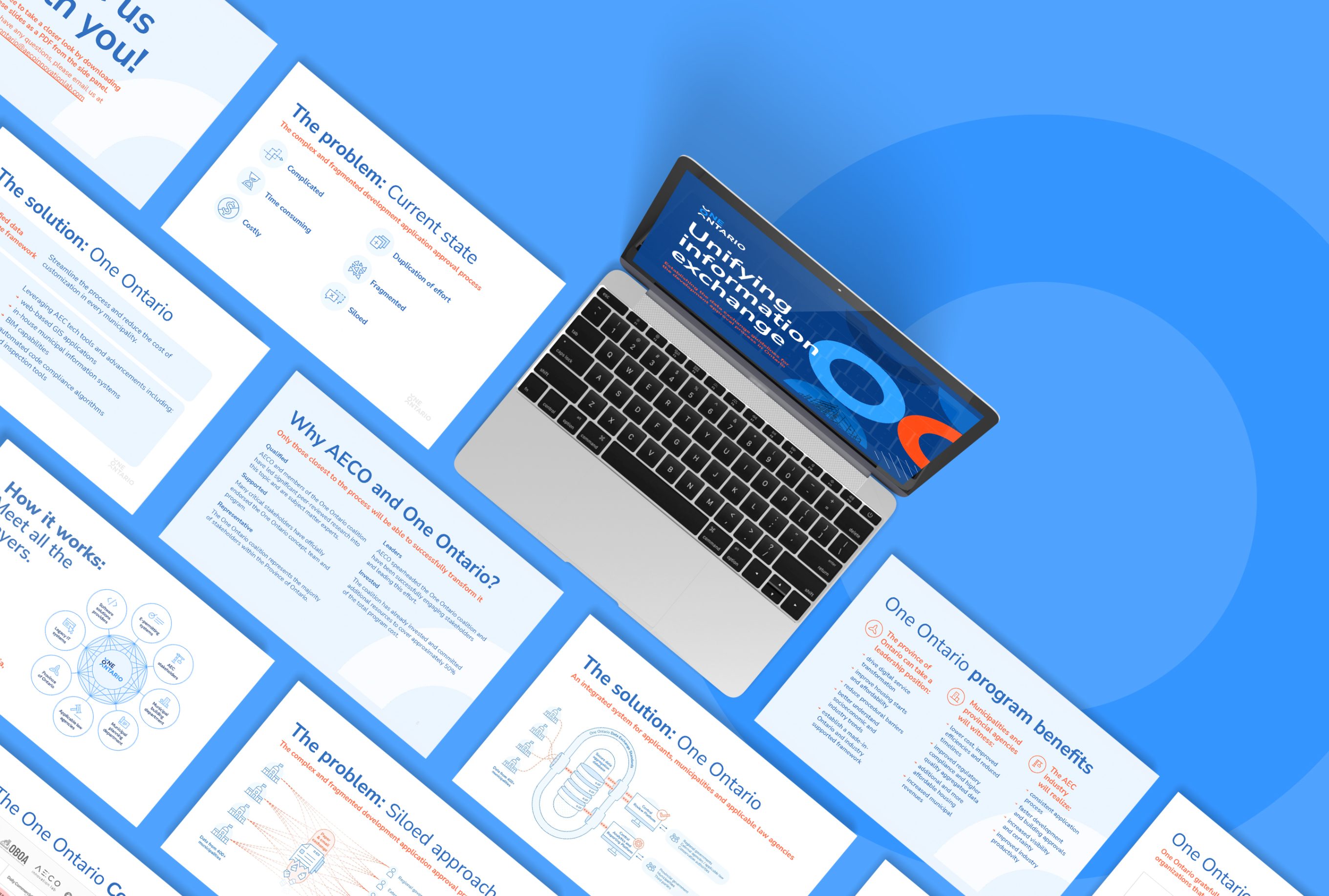
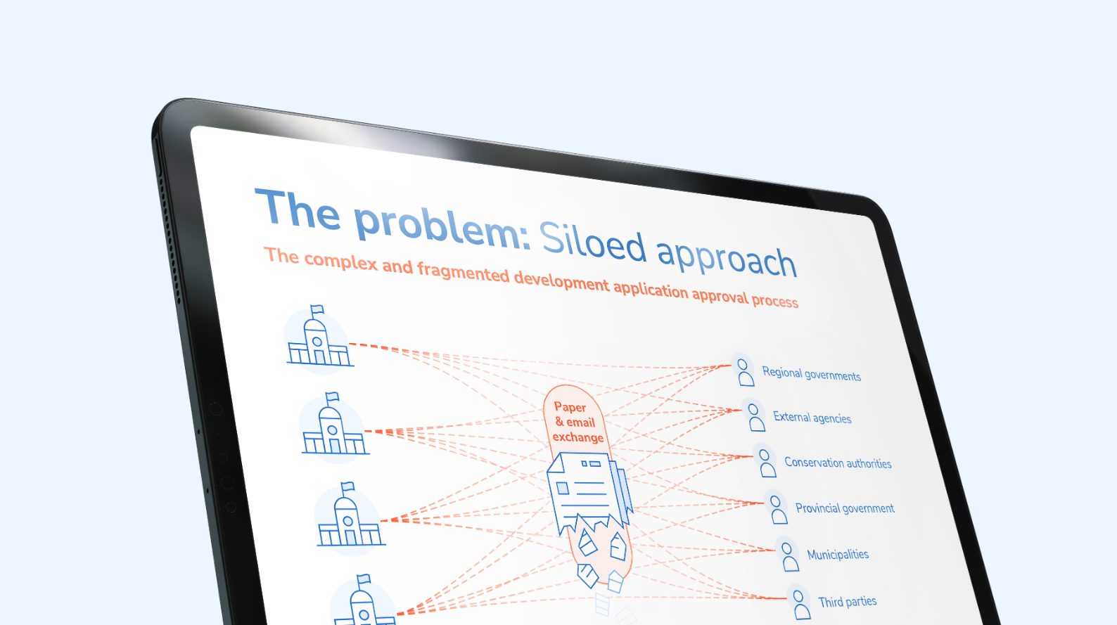
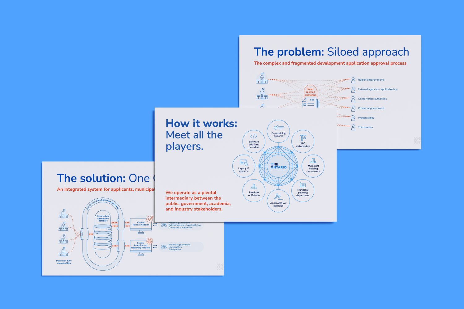
An important goal for One Ontario is the communication of a complex message. This is a not-for-profit that is trying to explain why development approvals in Ontario are problematic, and what needs to change. So finding ways to create clear presentations was key. I worked closely with the team to define what was needed, and I developed a simple infographic style to explain complicated processes and concepts.
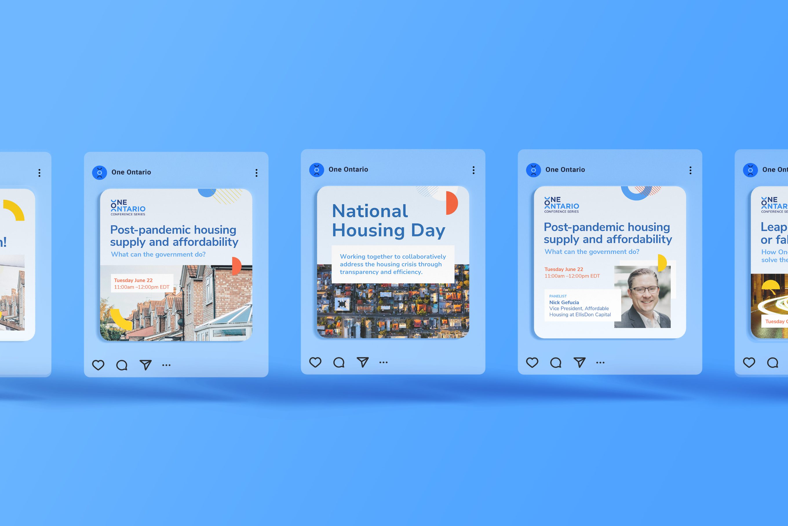
One Ontario isn't heavy into social media, but does use it to help communicate mandates, news, events, and significant milestones. I worked with the team to create a social plan, and guide the ongoing content creation. Posts are government- and academic-facing, so clarity and professionalism were key. I created reusable, flexible layouts so team members can make posts as needed.

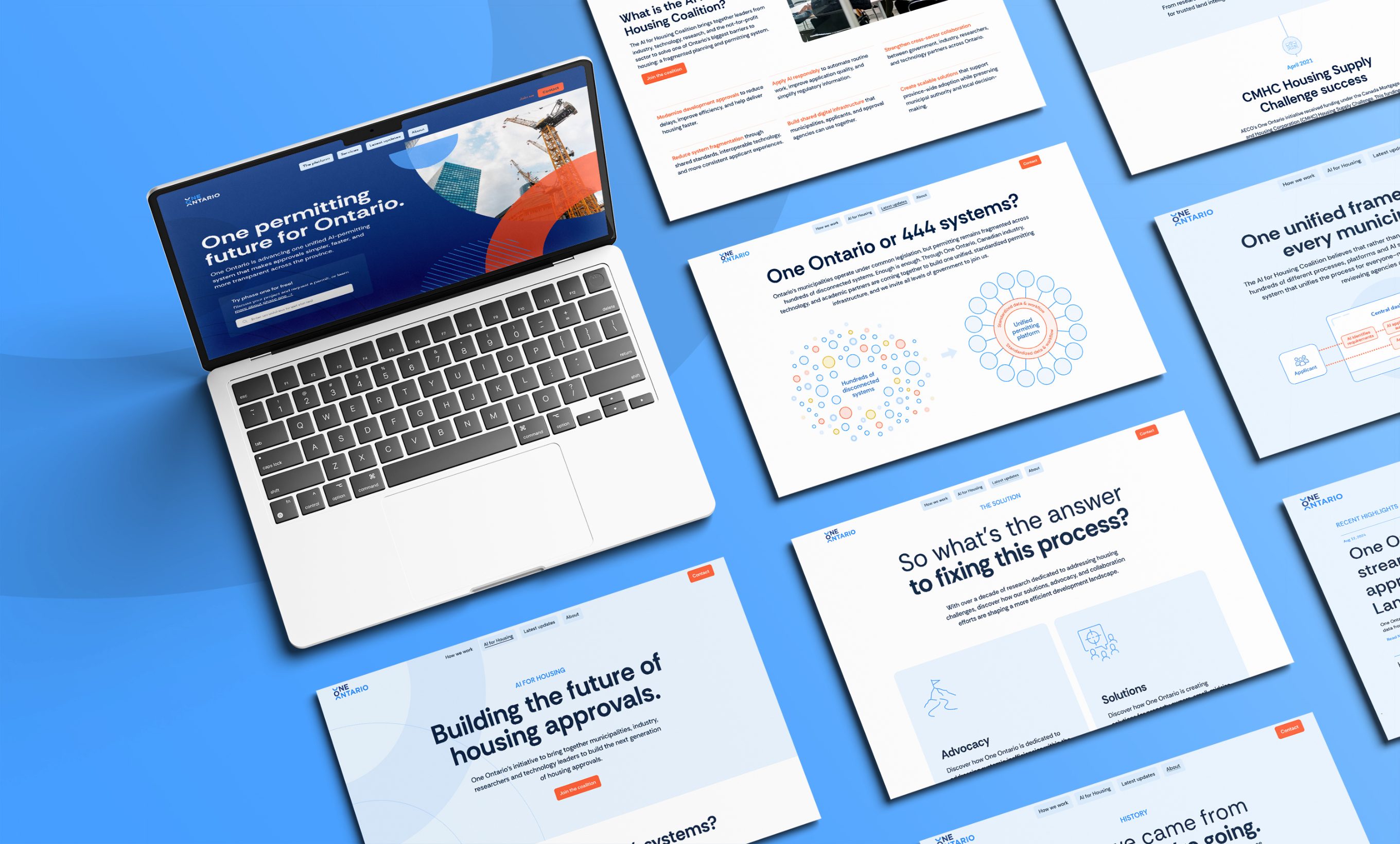
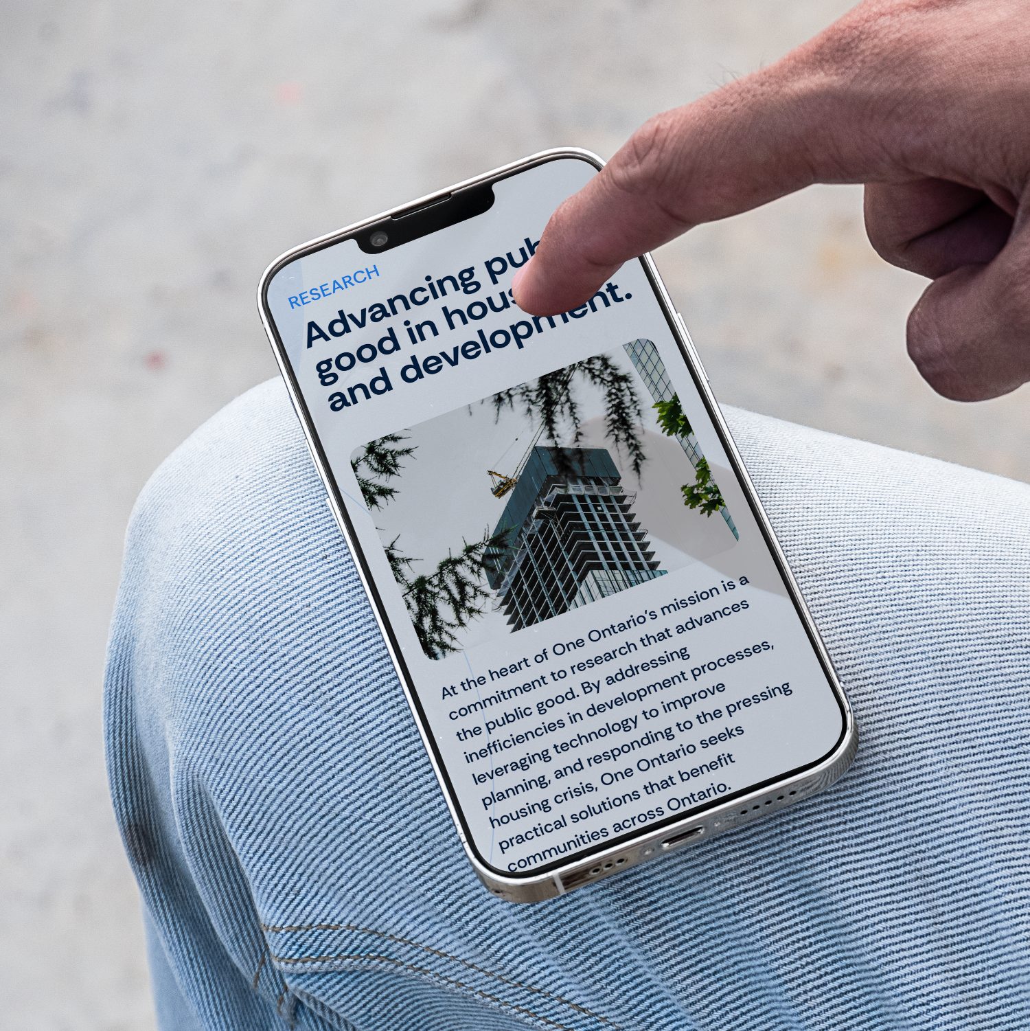
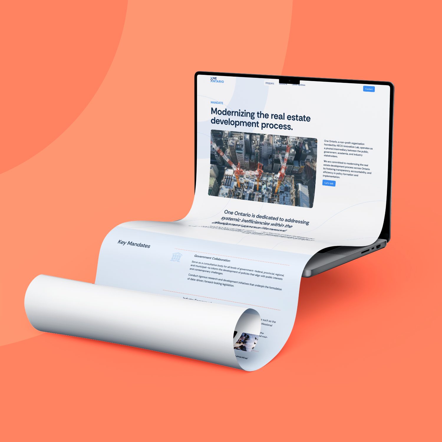
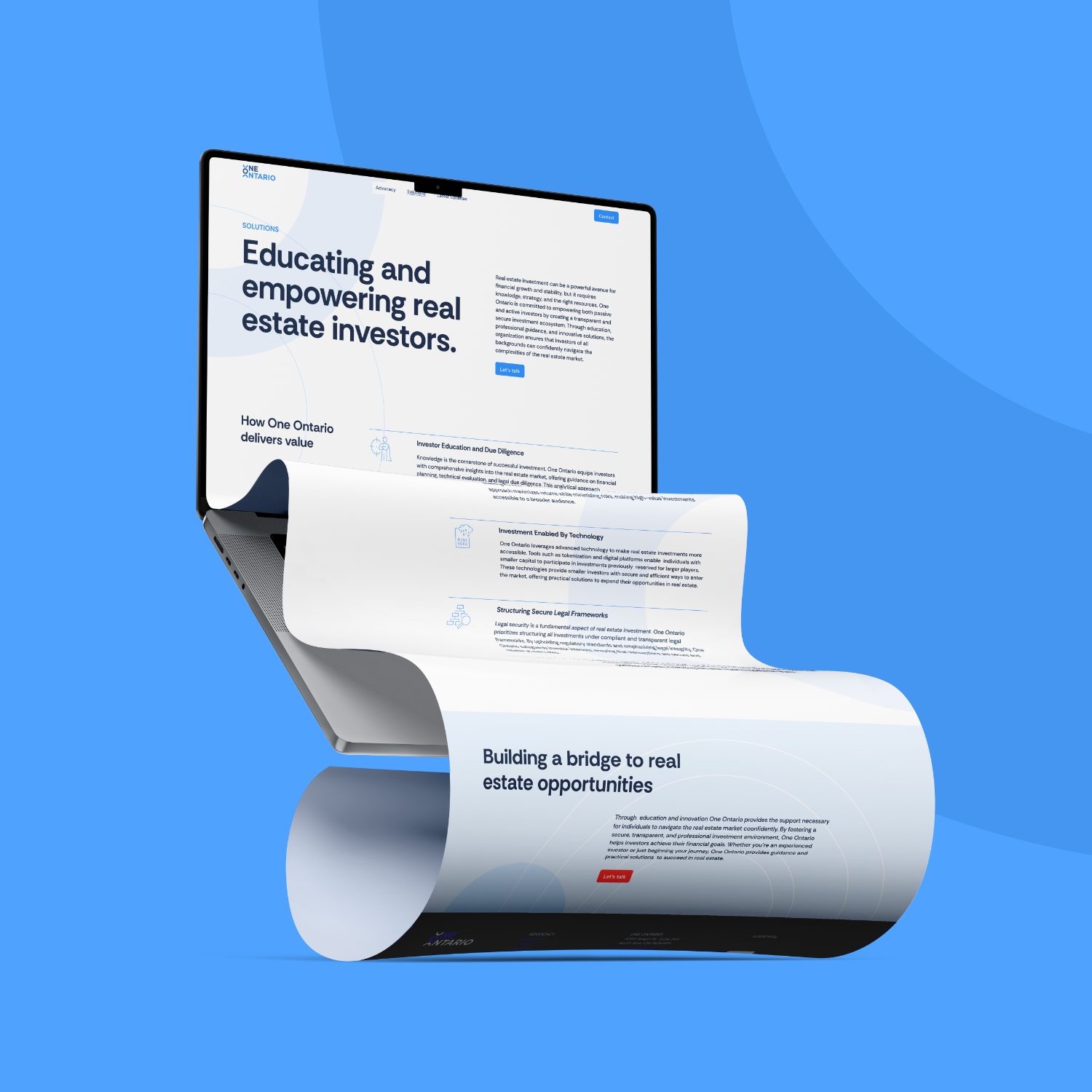
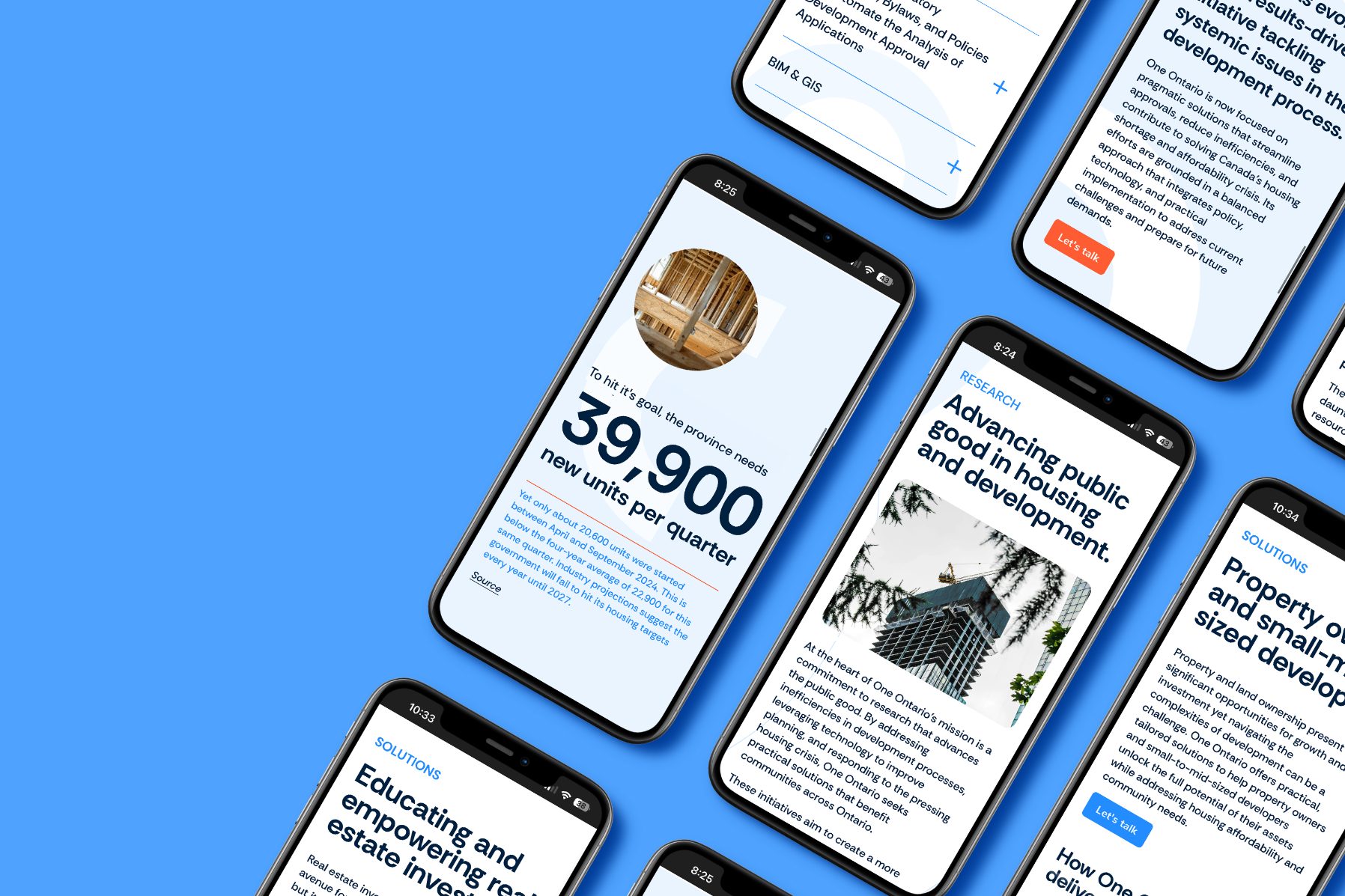
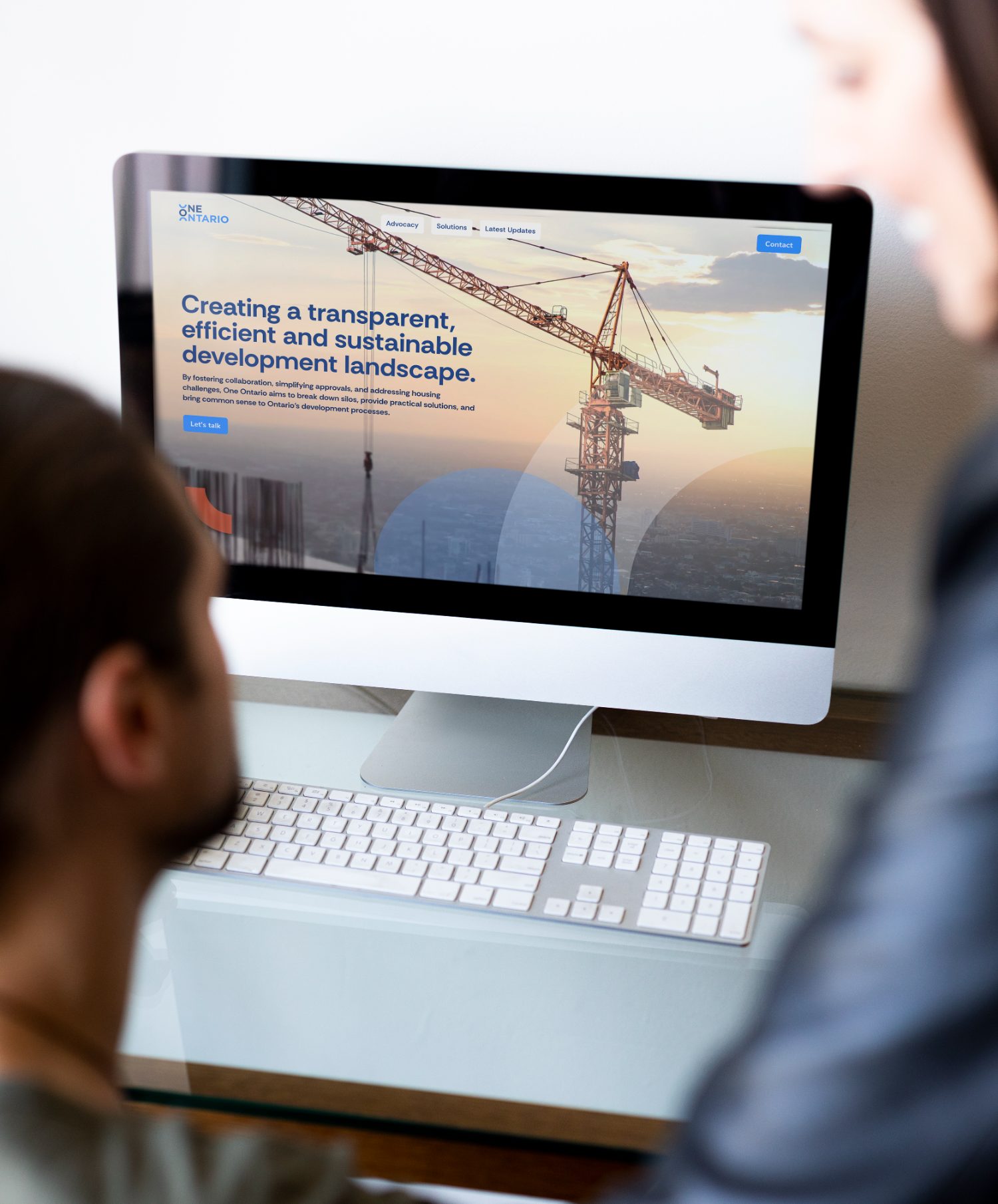
The website for One Ontario is an ever-changing hub. As mandates evolve, the design, layout and messaging have to keep up with it. That means a lot of internal alignment is needed to make sure the right content is communicated. As the brand owner, I build and maintain the frequent updates, ensuring consistency within the brand.
During COVID, professional conferences were either cancelled or held online. One Ontario signed up to host a booth at the annual OBOA online event, and that meant navigating an entire interactive world! Flexibility in design and execution was extremely limited, but the project was a lot of fun. It was a unique challenge!